
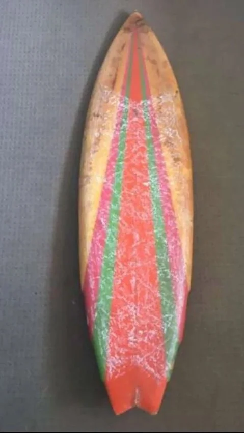
Conception to creation
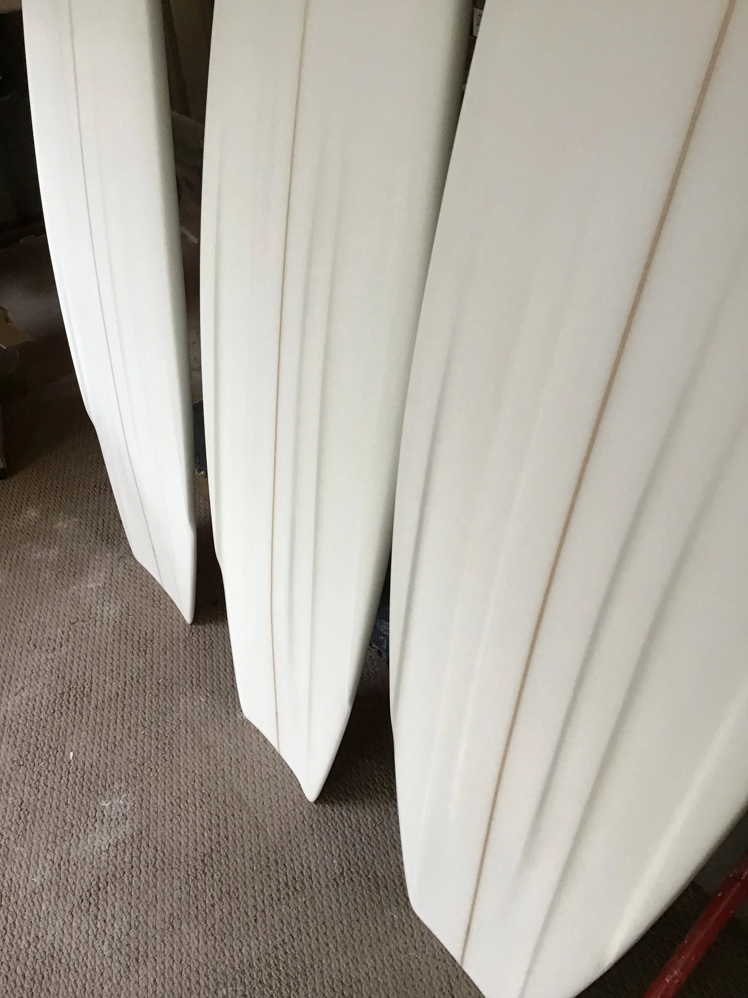
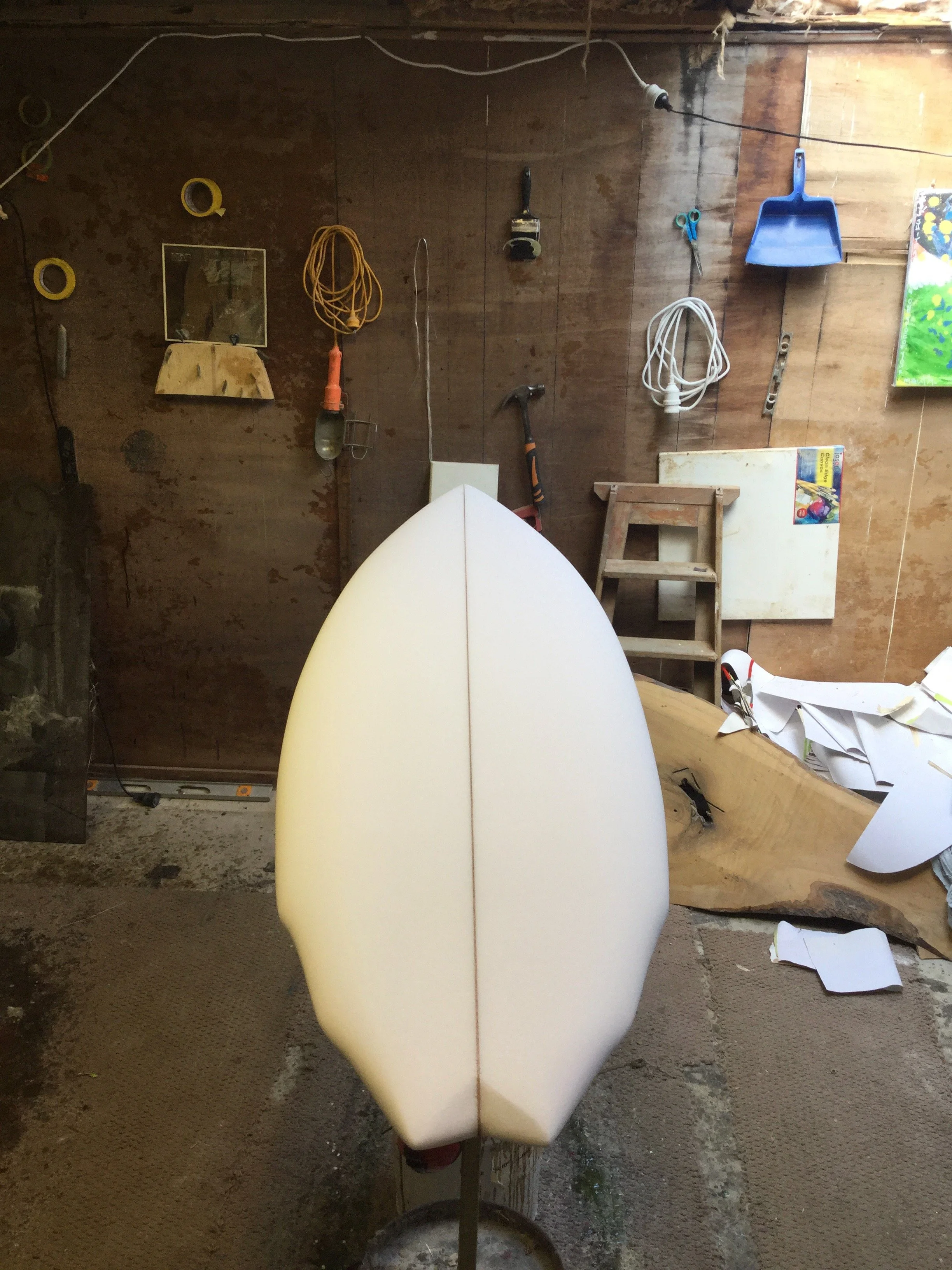
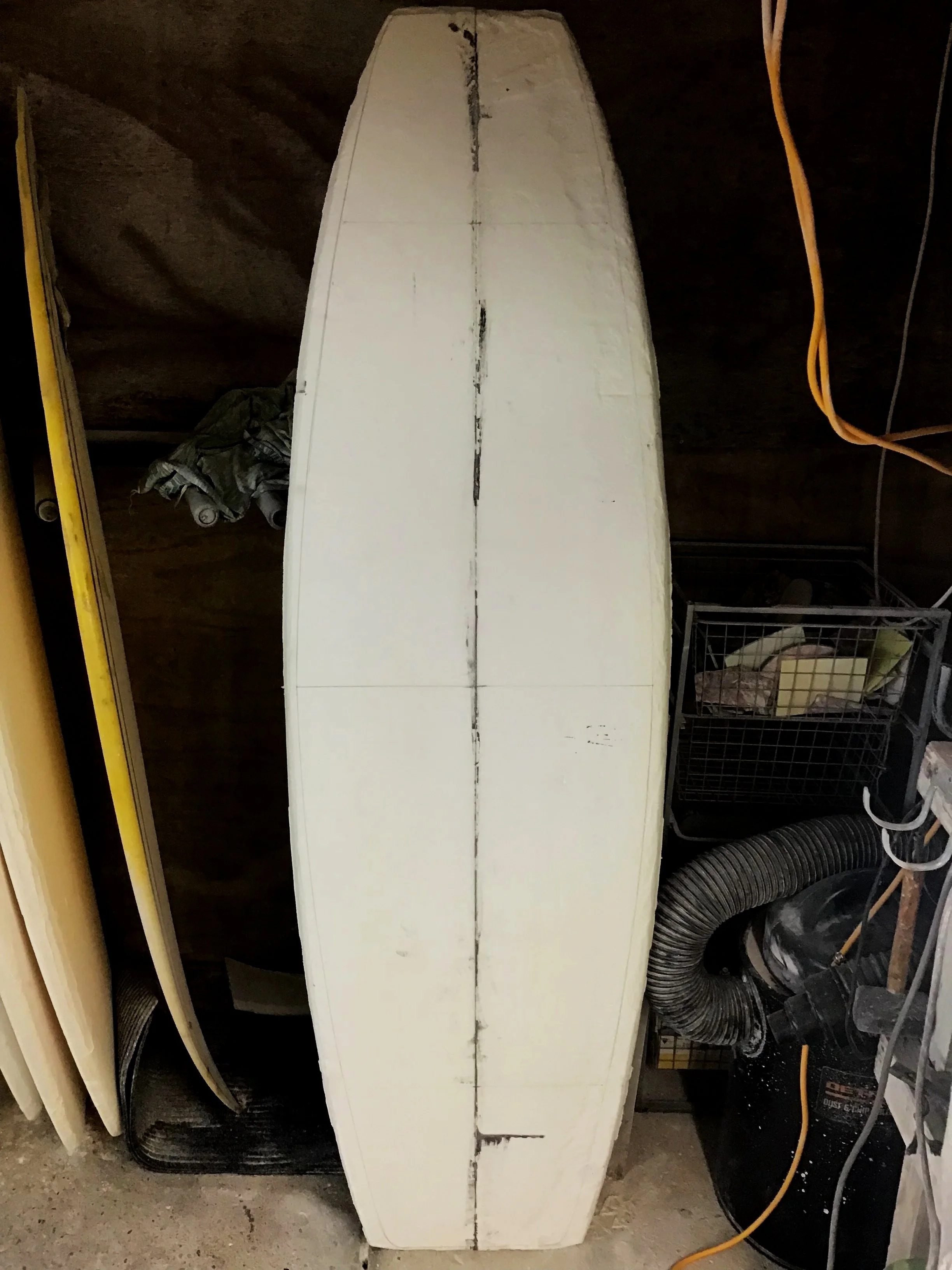
During the creation of these last four boards, it was a truly humbling experience. Getting out of my comfort zone and forcing myself to use different techniques—including acrylic colour, coloured resin (tints, pigments, flow coats), and clear resin applied at various stages—was both challenging and rewarding. It became a nod to the history of surfboard making, and to all those who have perfected the craft, past and present. As I shape and do all the production myself, it can at times become overwhelming and exhausting. To make the process more complicated, laborious, and time-consuming might seem ludicrous—but let me explain. Creating a shape from a mental concept is one thing, but once the shape is complete, it often becomes—for lack of a better word—a race to get the glass on the shaped blank and production underway. This urgency exists for many reasons: you don’t want to leave a blank lying around, as the stringer might swell or twist, it could get damaged, dirty, collect overspray, or absorb old shed DNA into the foam. There's also the strong desire to get the board into the water. Once the blank is shaped, it's usually time to get moving. But not this time. At this point, I was focused on the art form—getting out of my comfort zone and refining my skills. I knew there would be problems—there usually are—especially working through the extremes of summer in an old shed built sometime in the 1980s. With years of experience, I'm always on the lookout for potential issues, solving problems as they arise and preventing others before they happen. It’s a constant cycle of maintenance, repetition, and problem-solving throughout the production process.Once the shapes had formed, and after tediously going over and preparing them for painting, I was hesitant to begin—worried about making a mistake on these beautifully hand-sculpted foam forms.
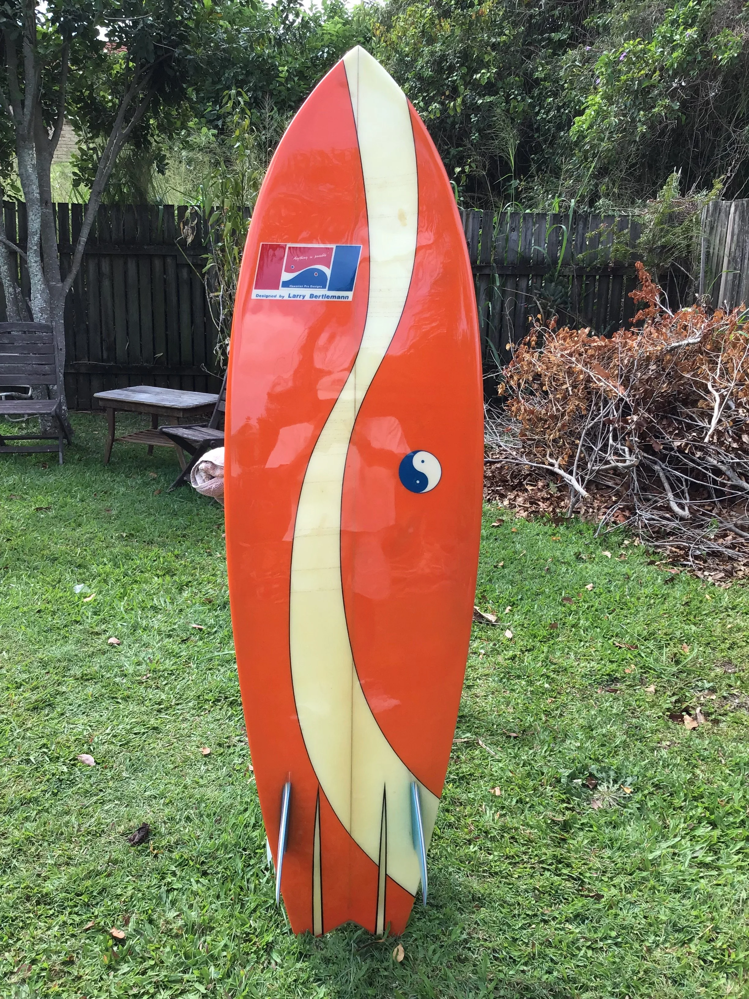
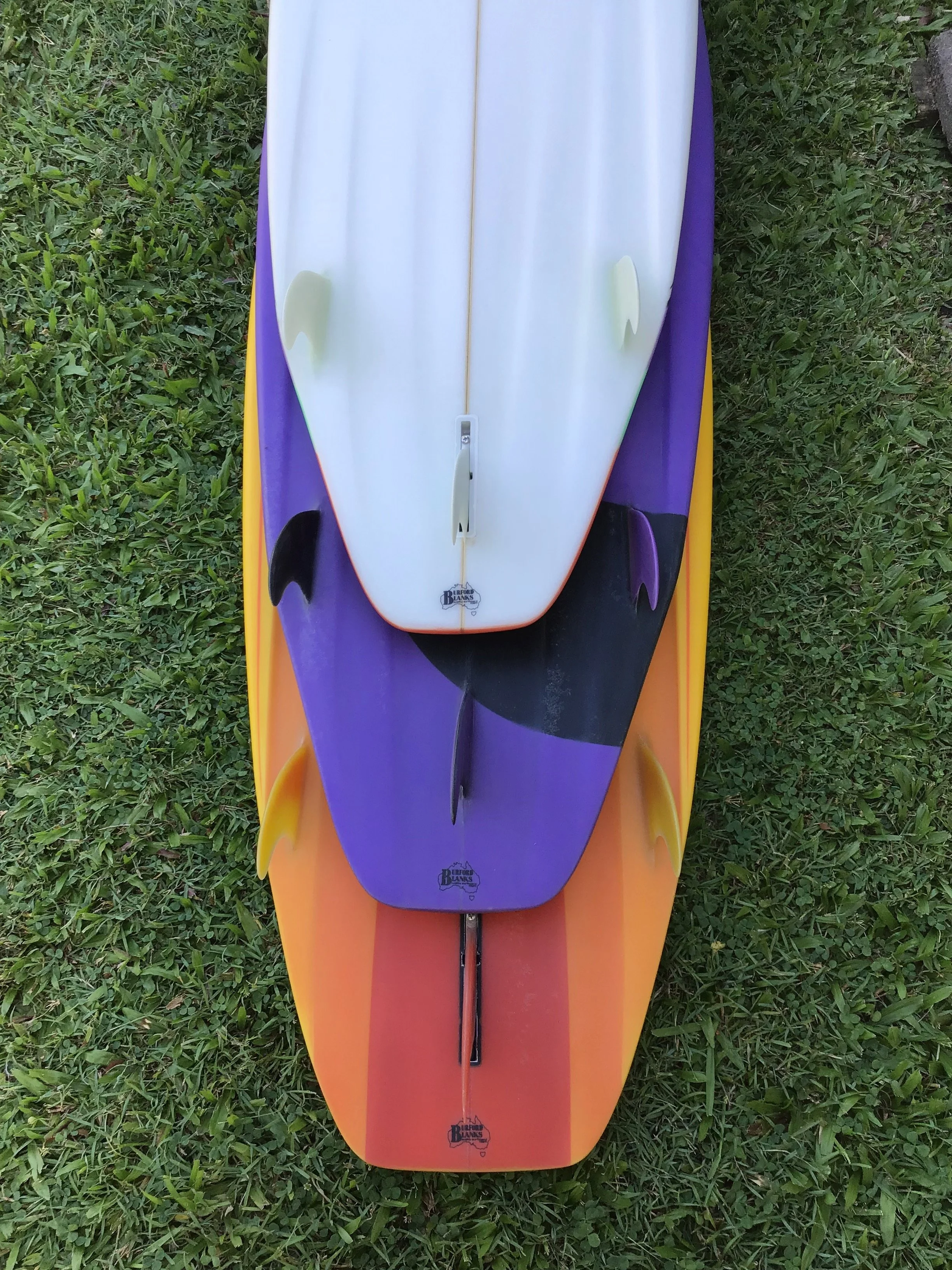
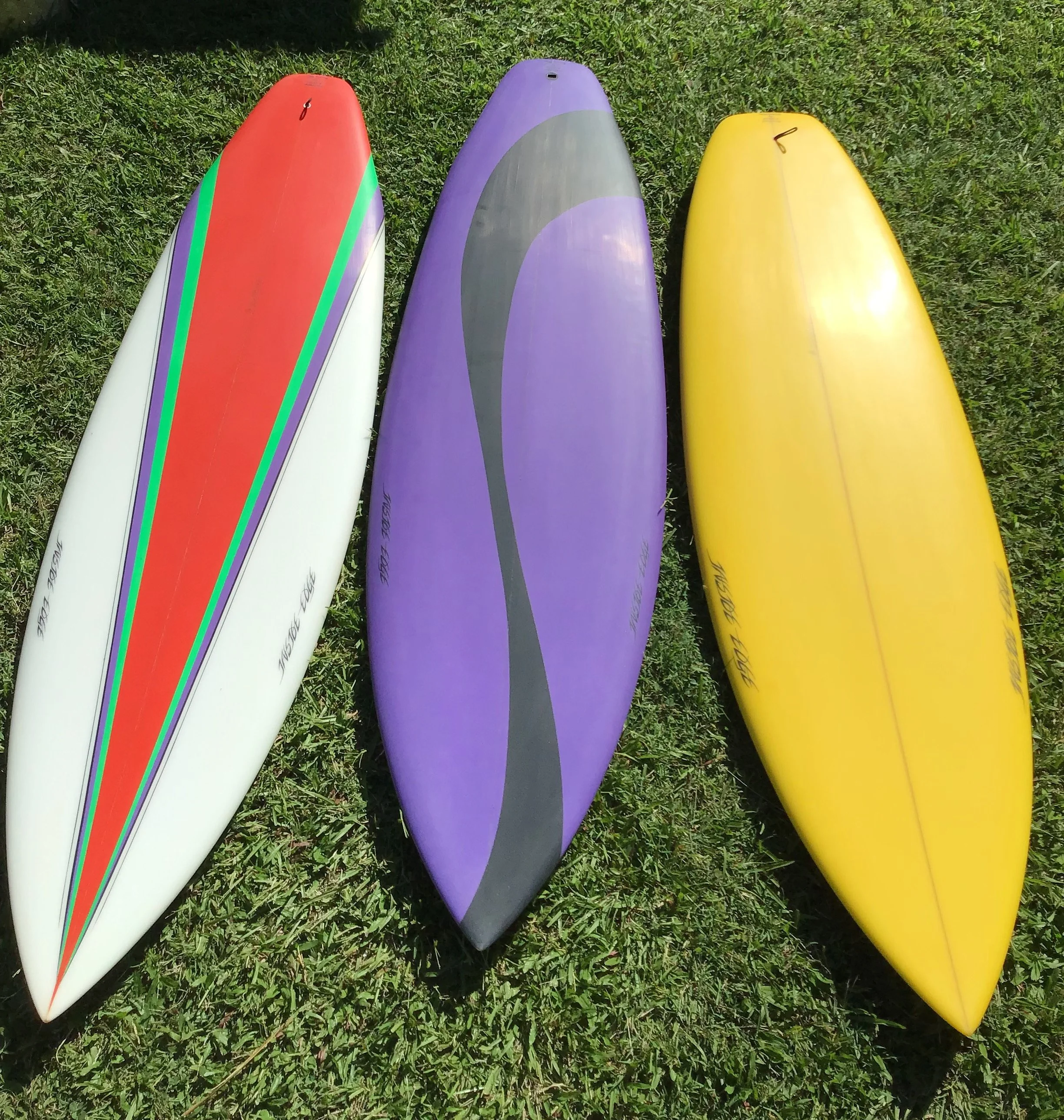
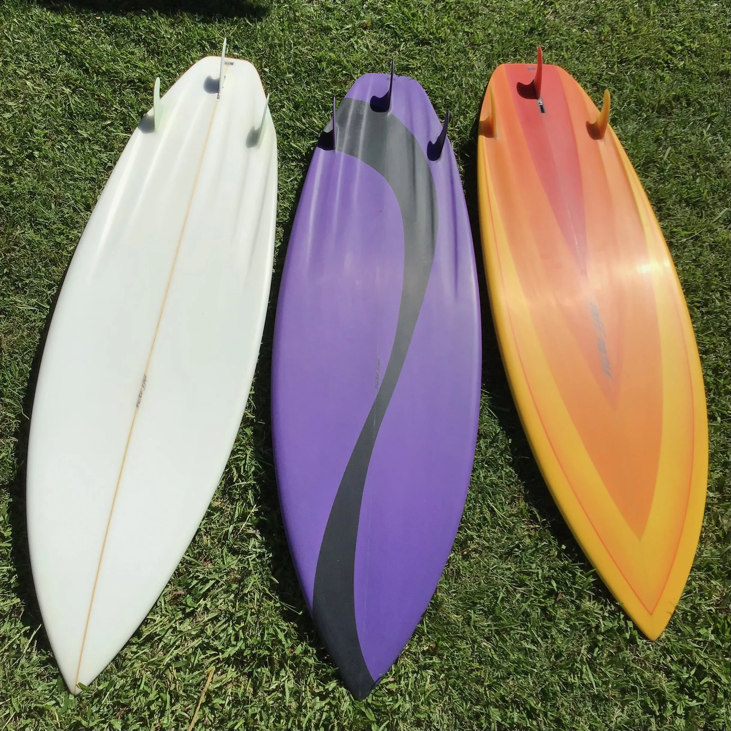
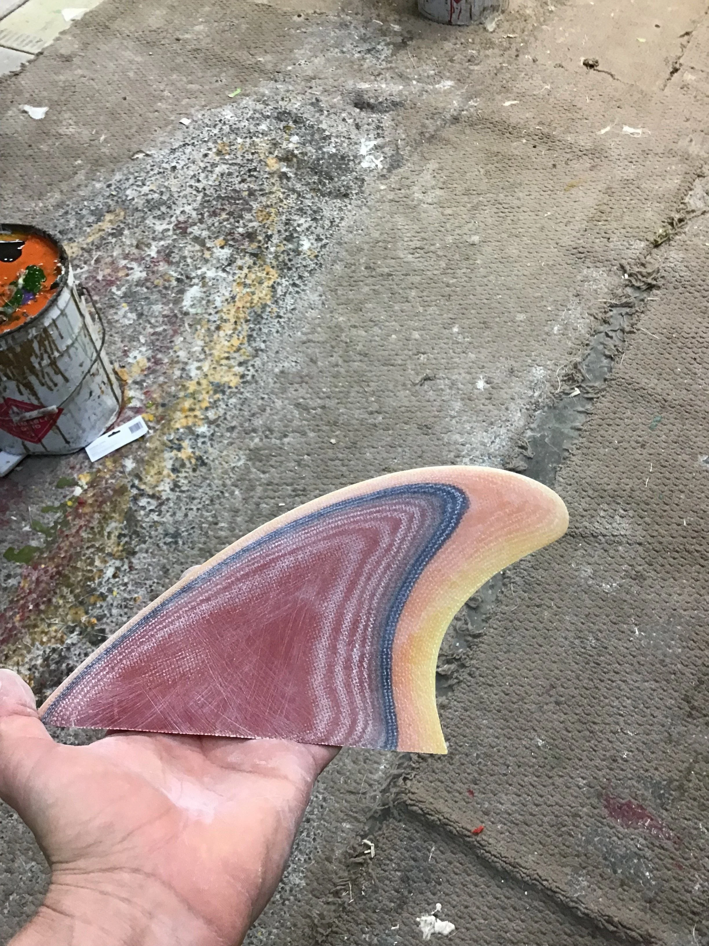
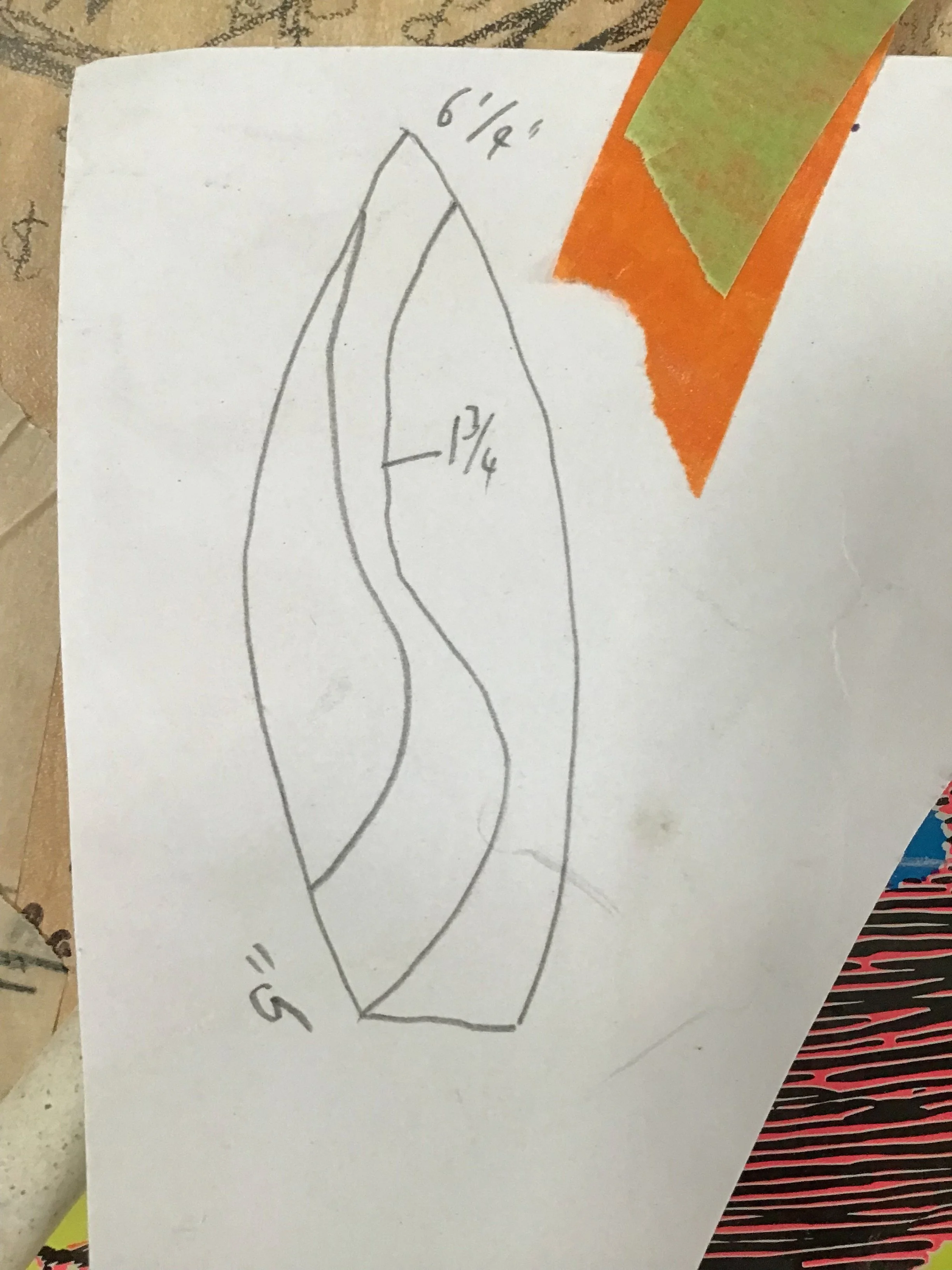
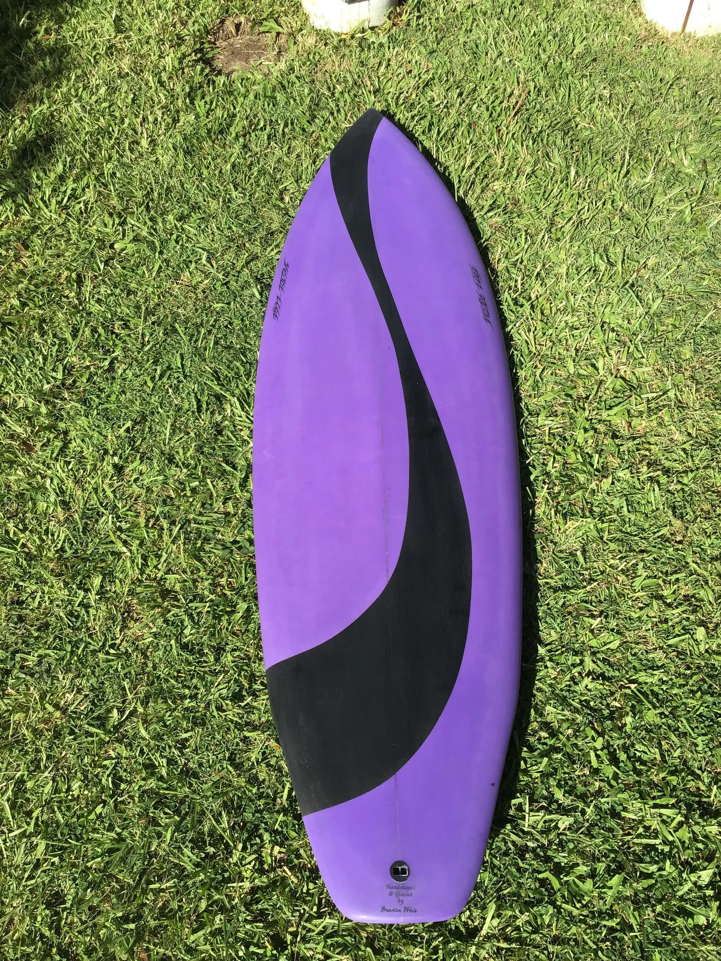
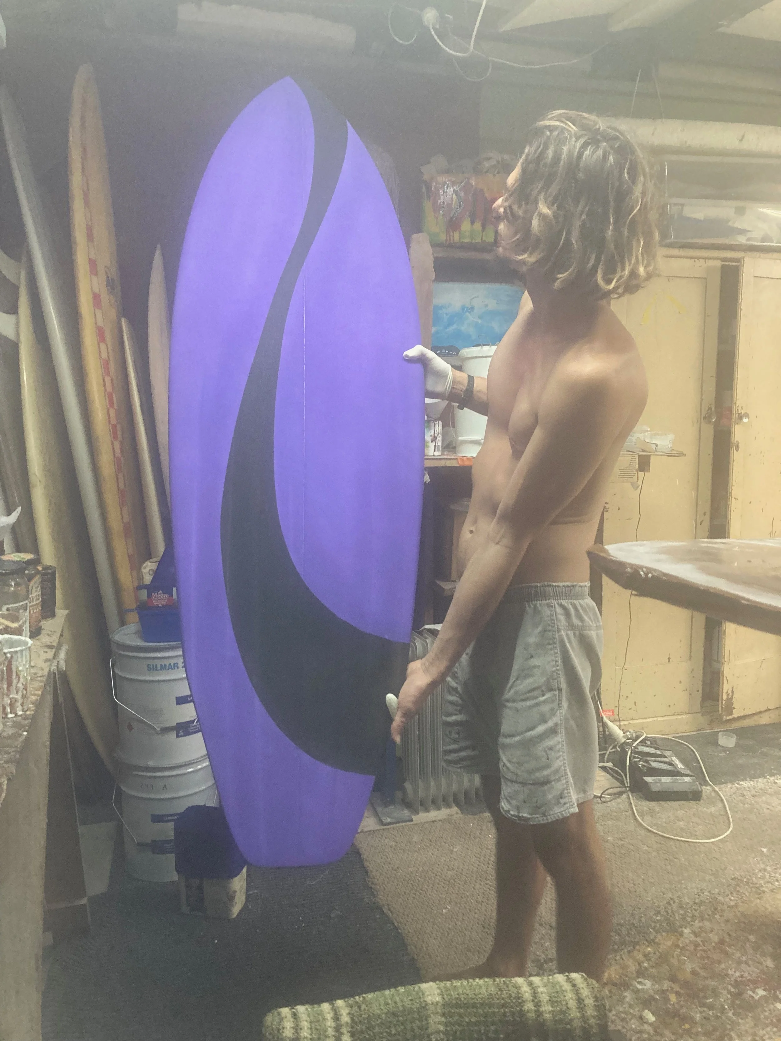
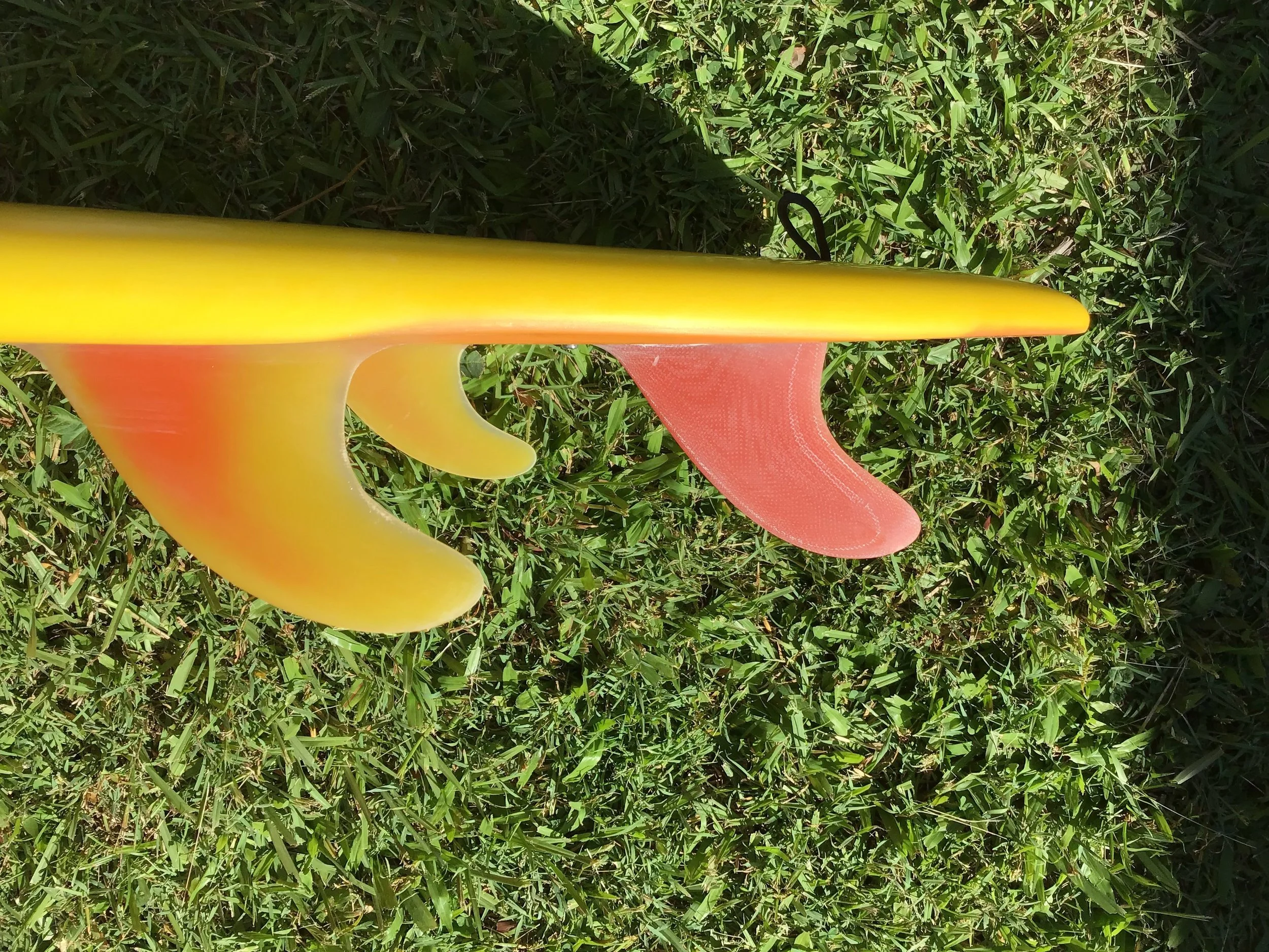
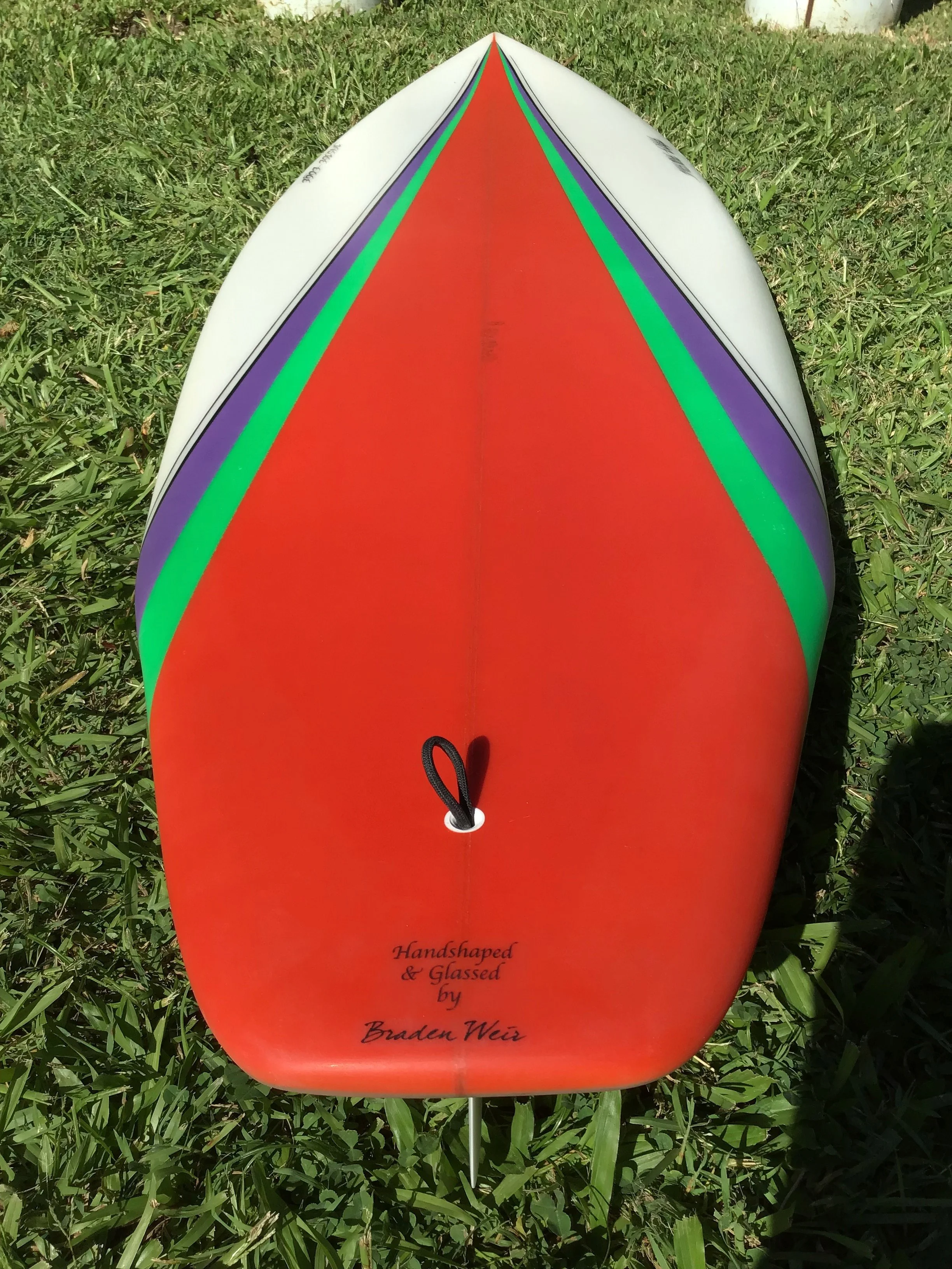
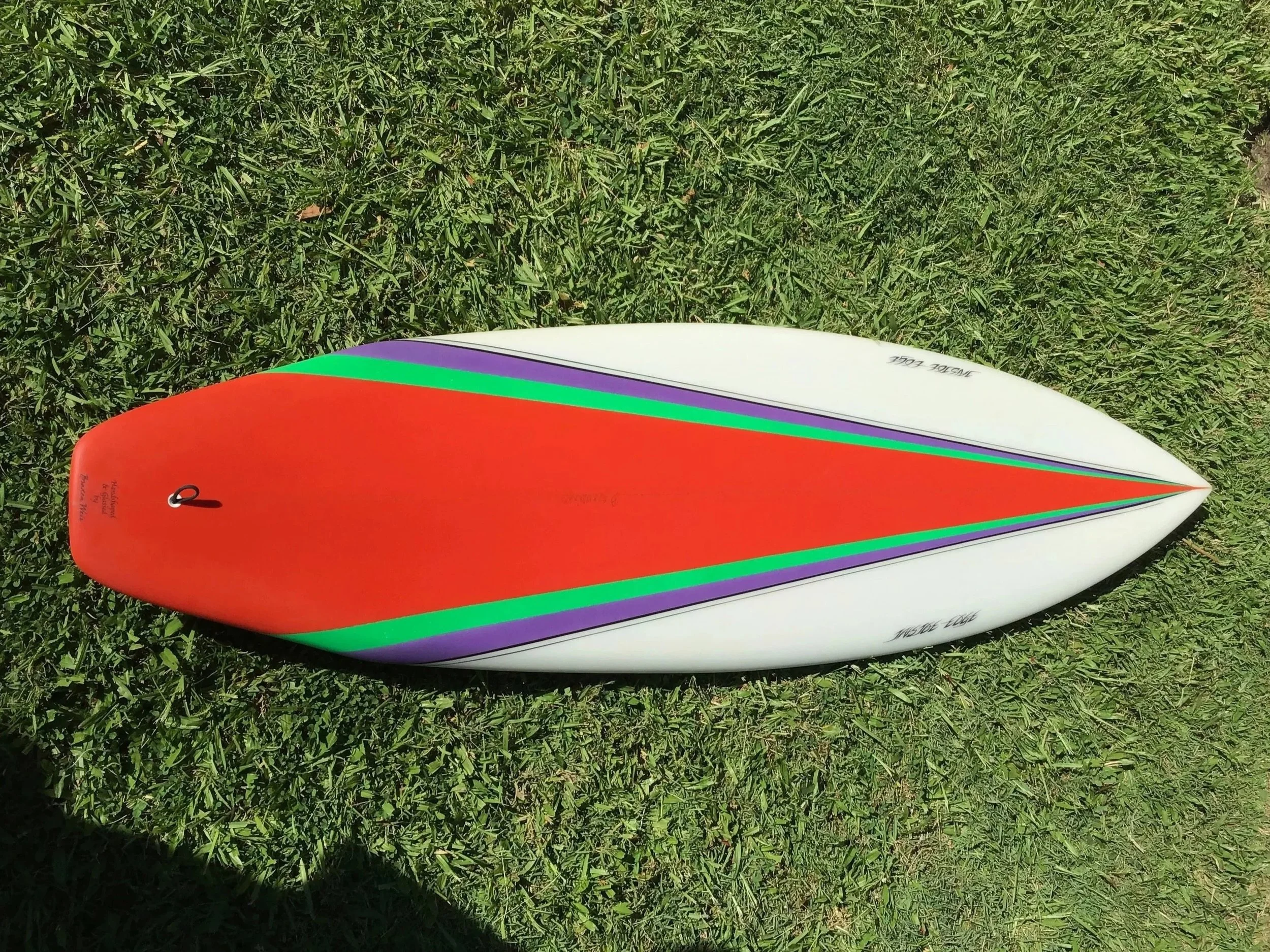
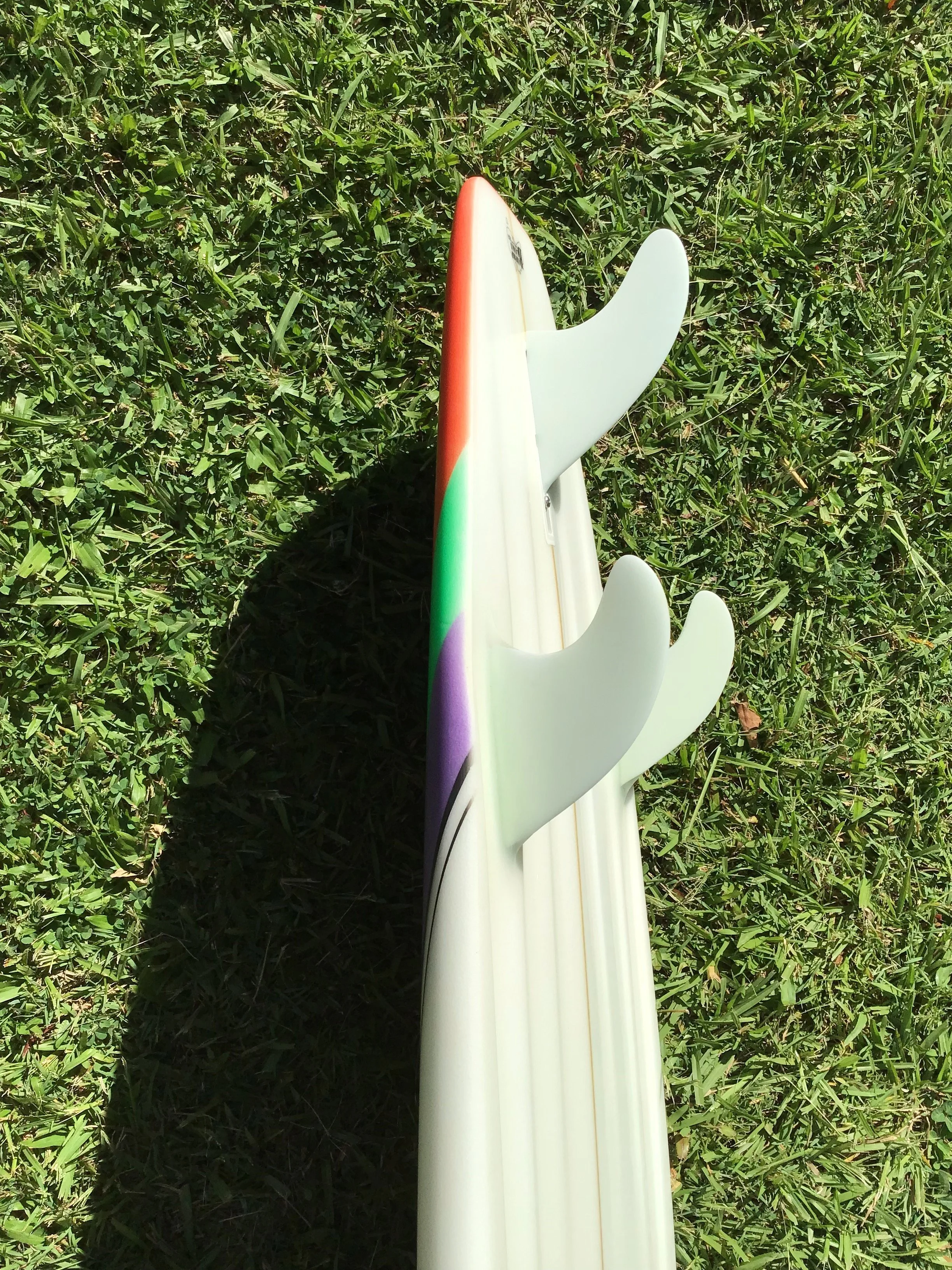
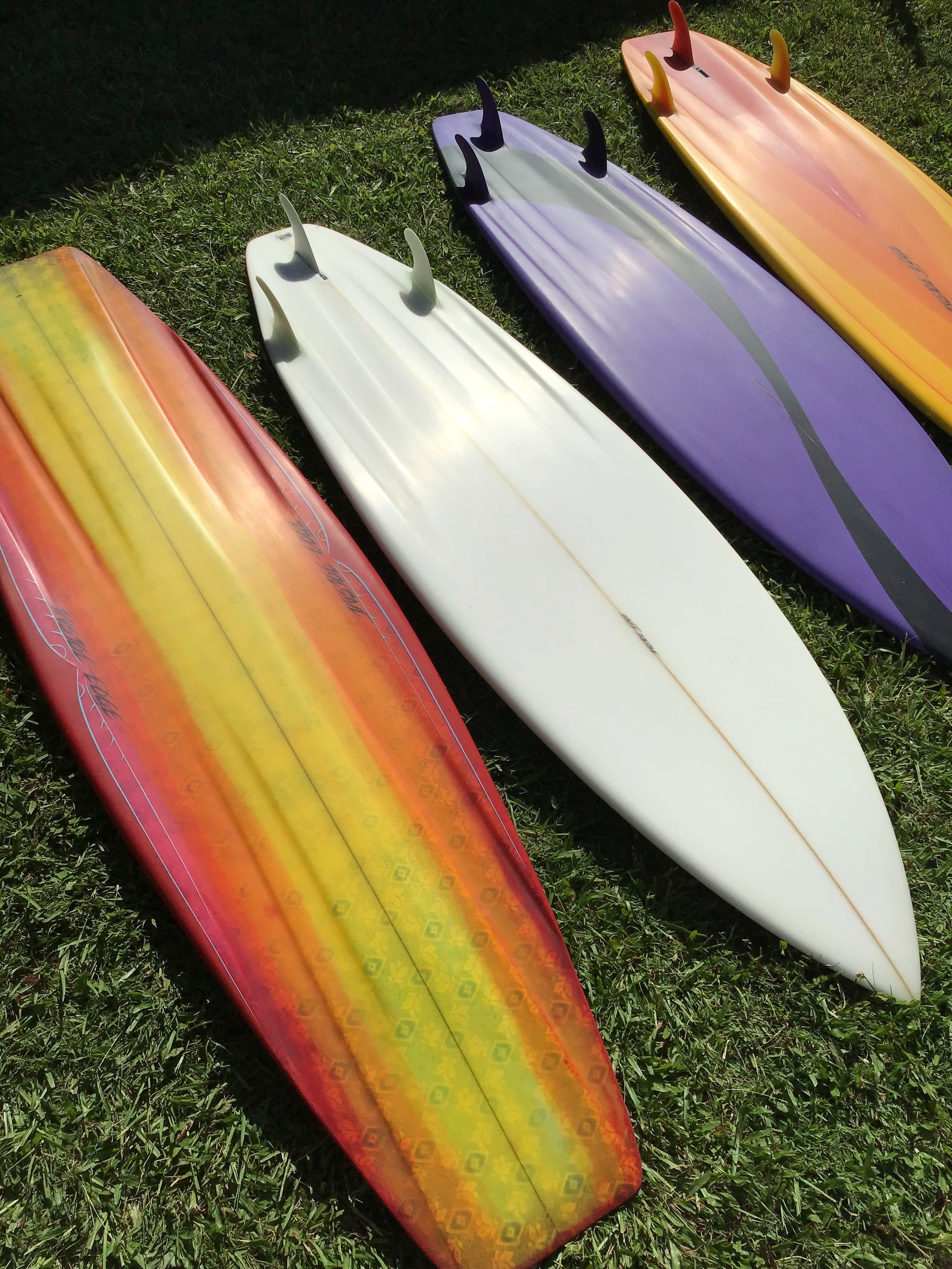
The first board was Ellen’s 5'11" Jim Pollard-inspired '80s thruster channel bottom, featuring a Larry Bertlemann inspired spray design she had in mind. I started by making a template from cardboard, using various outline templates to create and smooth a flowing curve. I’d taken notes and measurements off an original Larry Bertlemann board I had restored some months earlier. This gave me a rough guide, but I still had to connect and refine the curves. I marked several points on the board where colours would intersect—for example, the side fins landing completely within the black stripe, and the centre fin beginning at the lower side of the black area to complement the fin colour combination.
I sprayed the black first and let it cure for a day before taping it off to apply the purple (a mix of violet and magenta). Unfortunately, some of the black paint lifted with the tape—possibly due to the paint’s viscosity. The purple, even when thinned, dried with a slightly dusty texture—again likely a viscosity issue.Despite these challenges, the foam spray turned out nicely, with only a few small patchy areas in the black. The board was then fibreglassed in clear resin, free-lapped, with a 6-ounce bottom and 2 x 4oz layers on the deck. I foiled three fins from various panels: the side fins from black and purple scraps, and a custom layup (purple–black–purple) for the centre fin. Once the fins were foiled, roved, and laminated, the full board was filler-coated and the leg rope plug installed. The board was then sanded and wet-rubbed. Gloss resin was applied to both sides, followed by another sanding and wet rub to 800 grit.
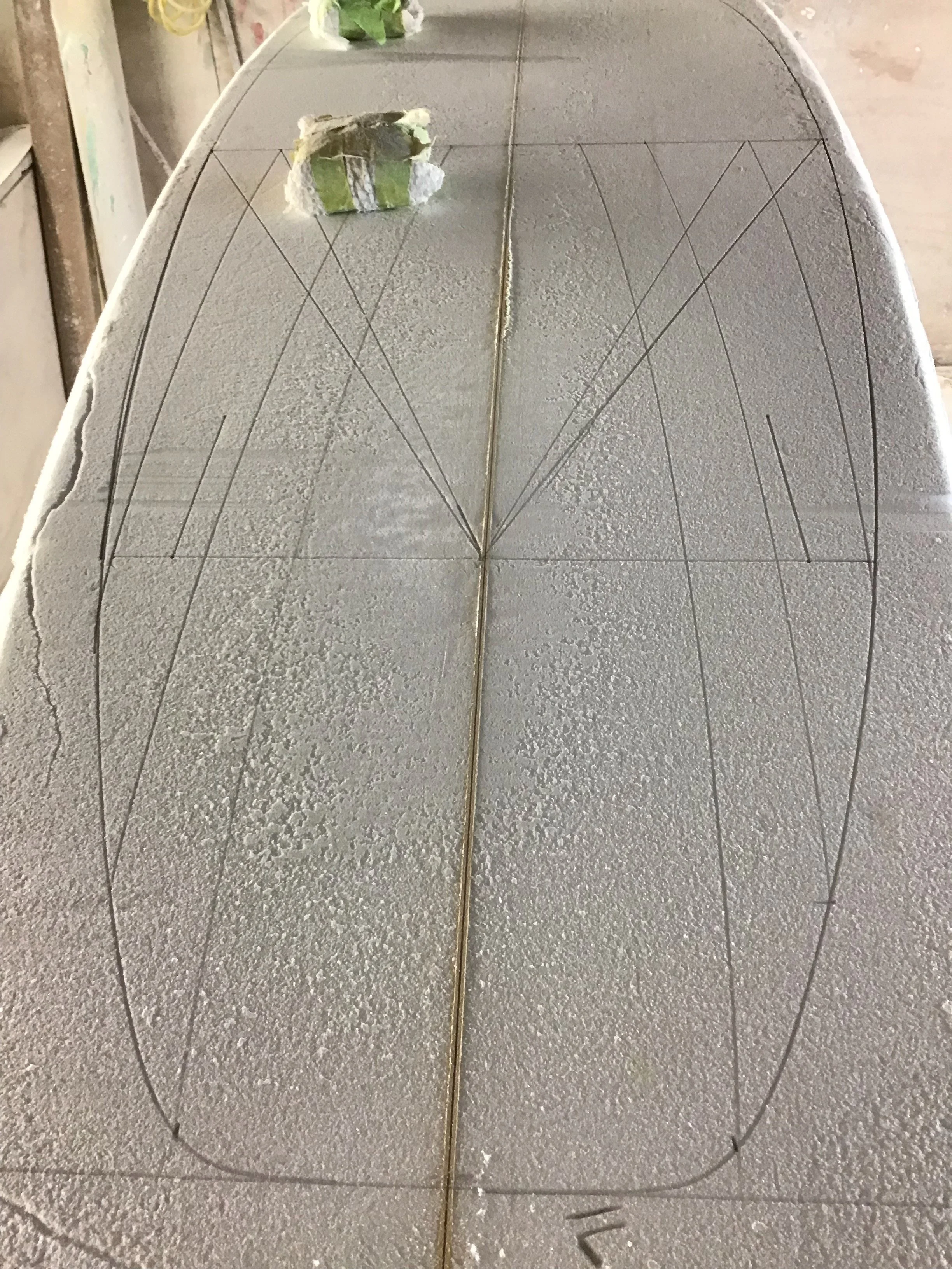
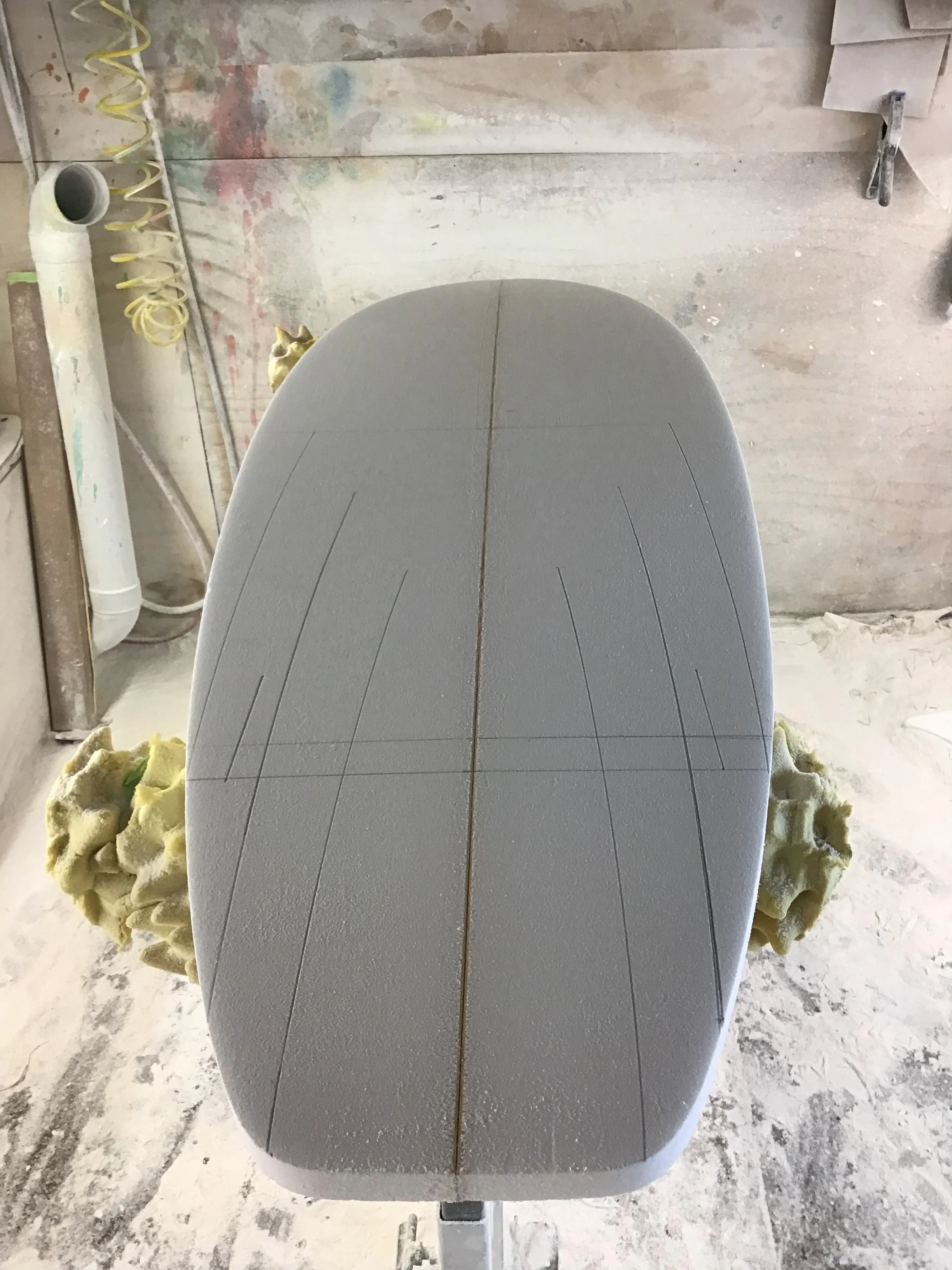
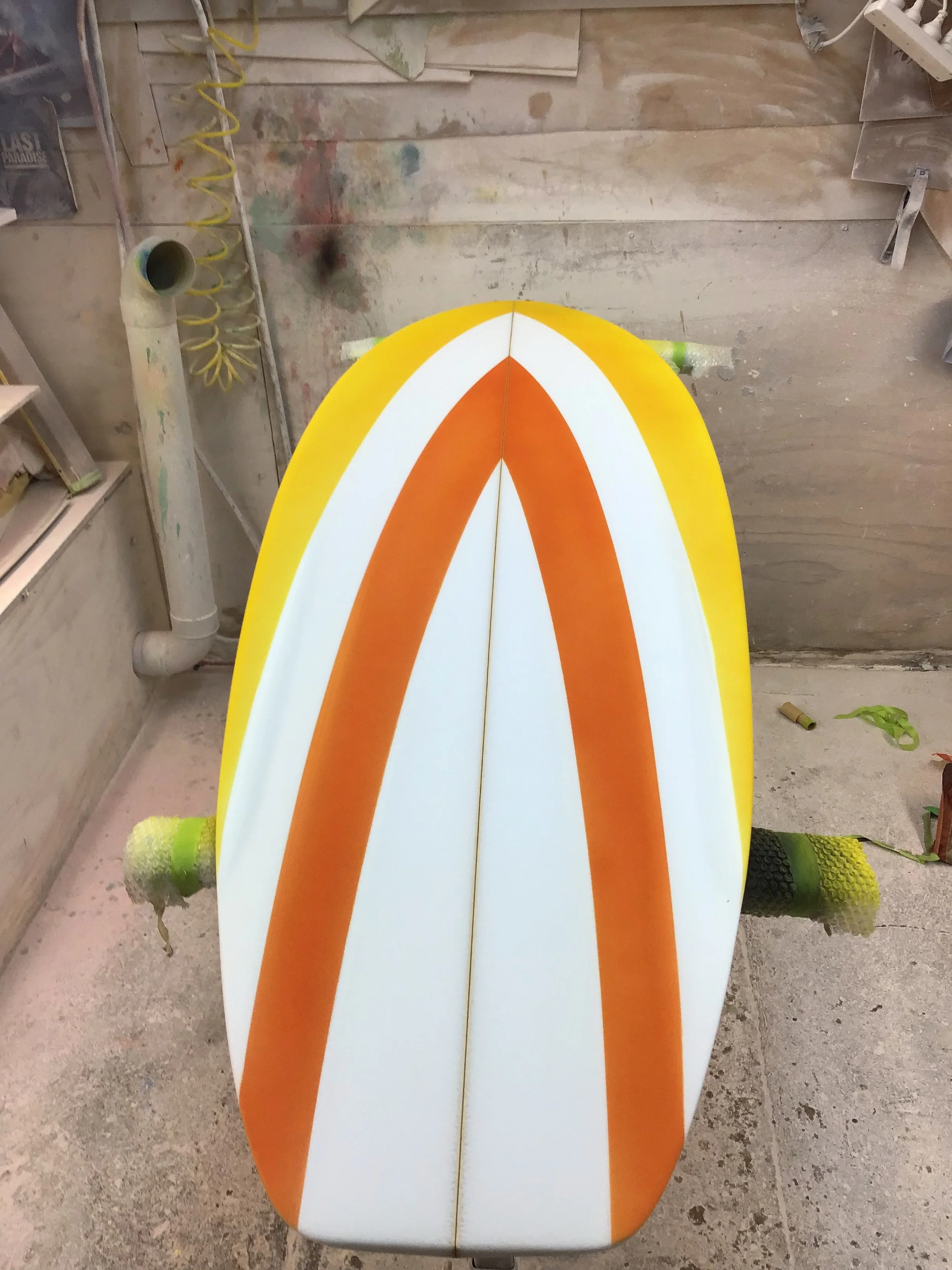
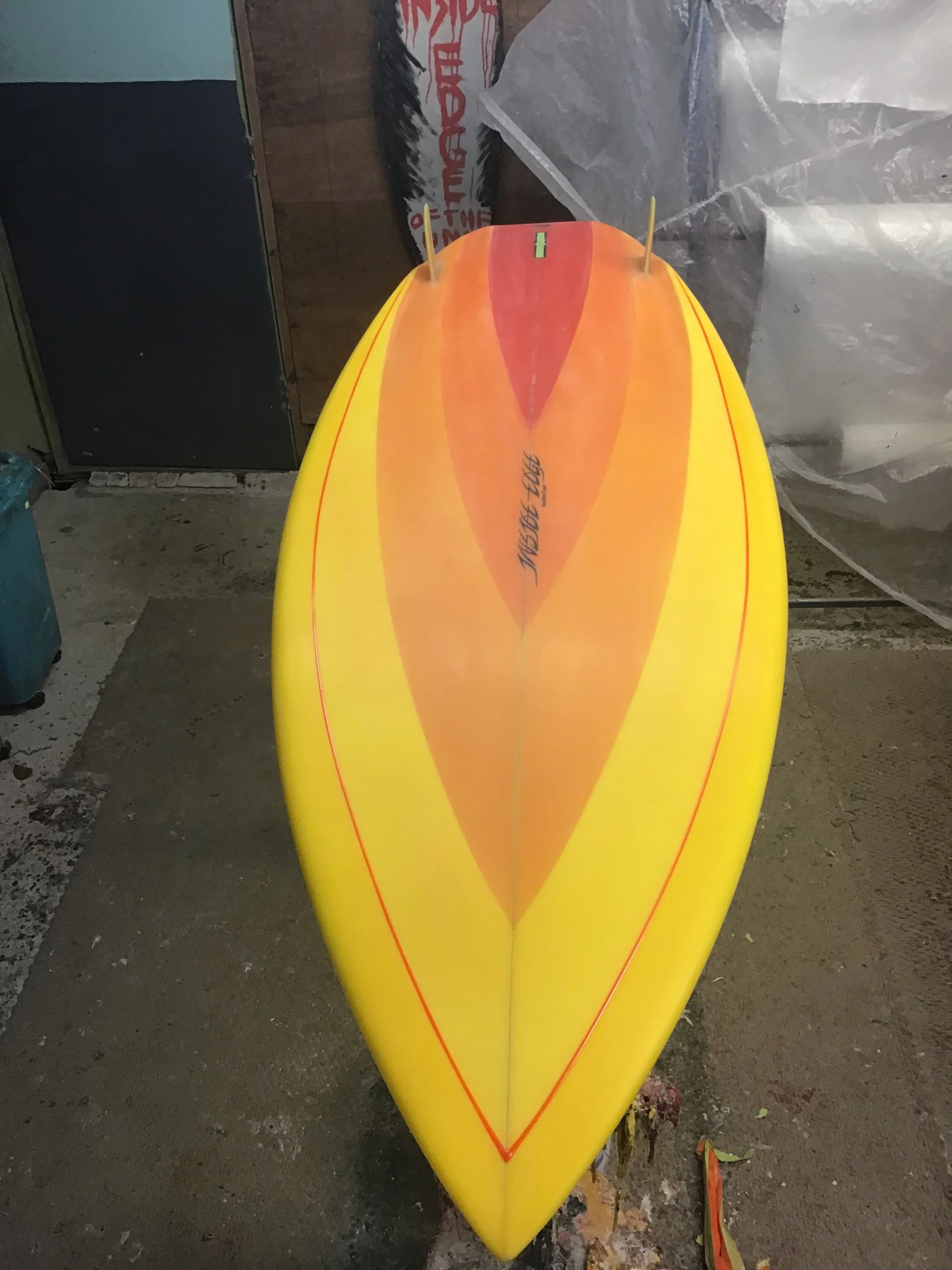
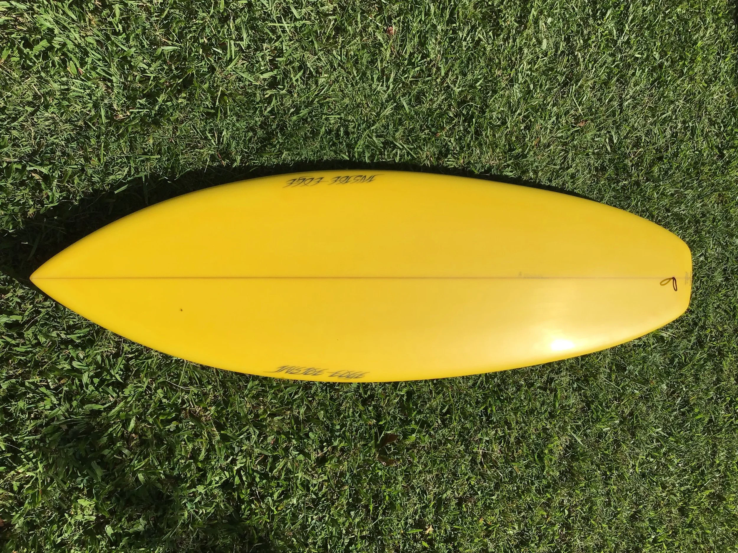
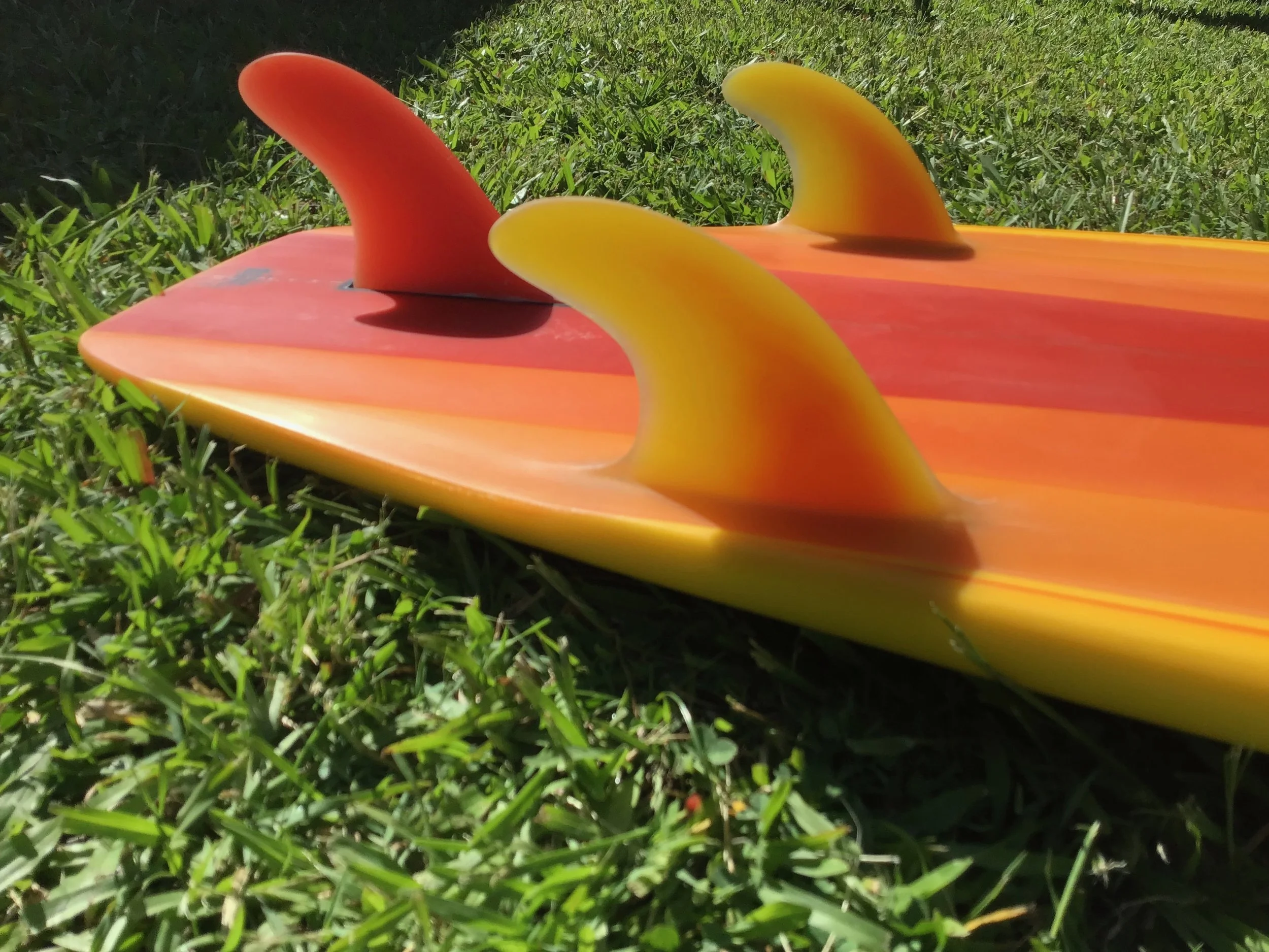
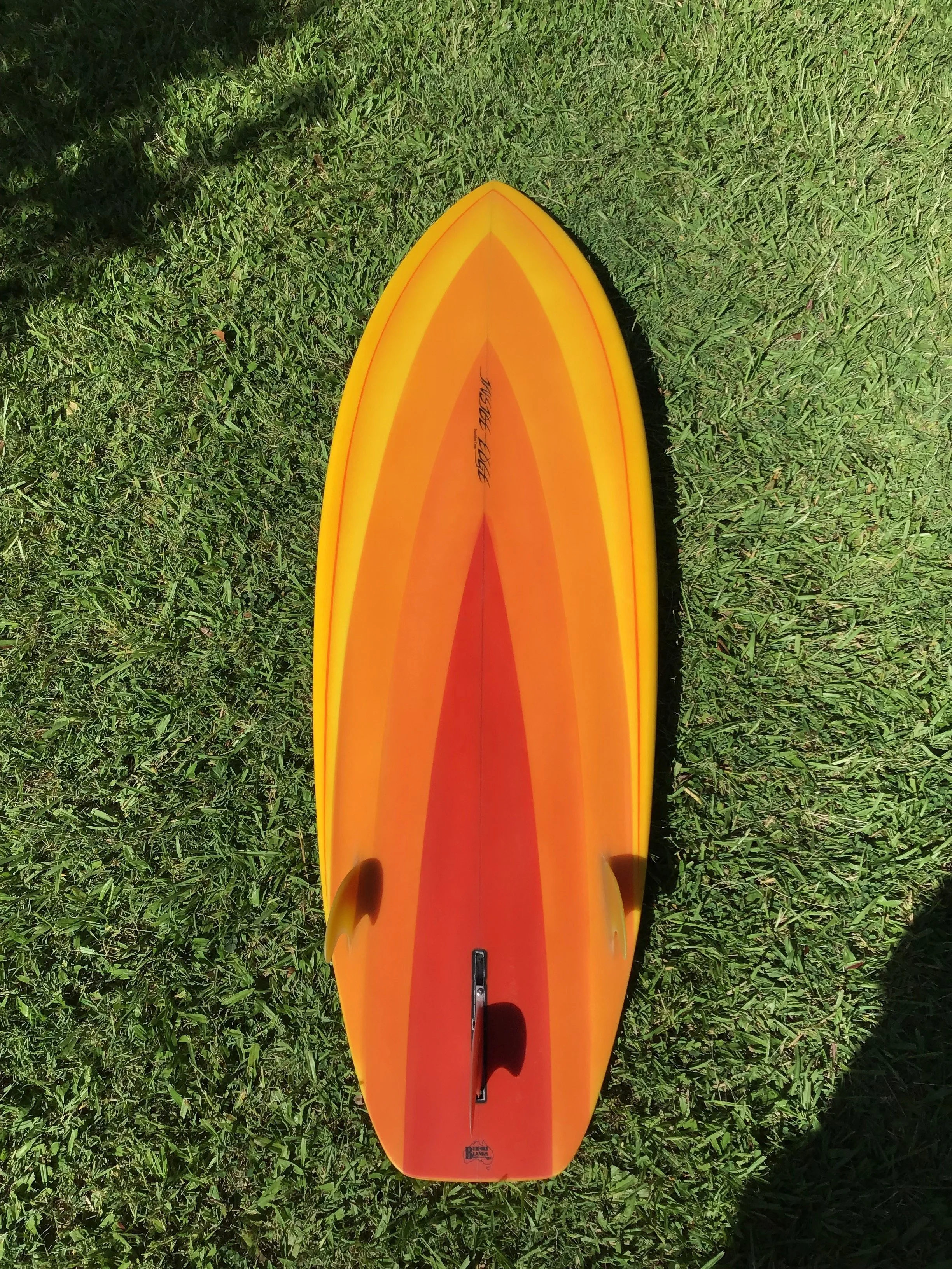
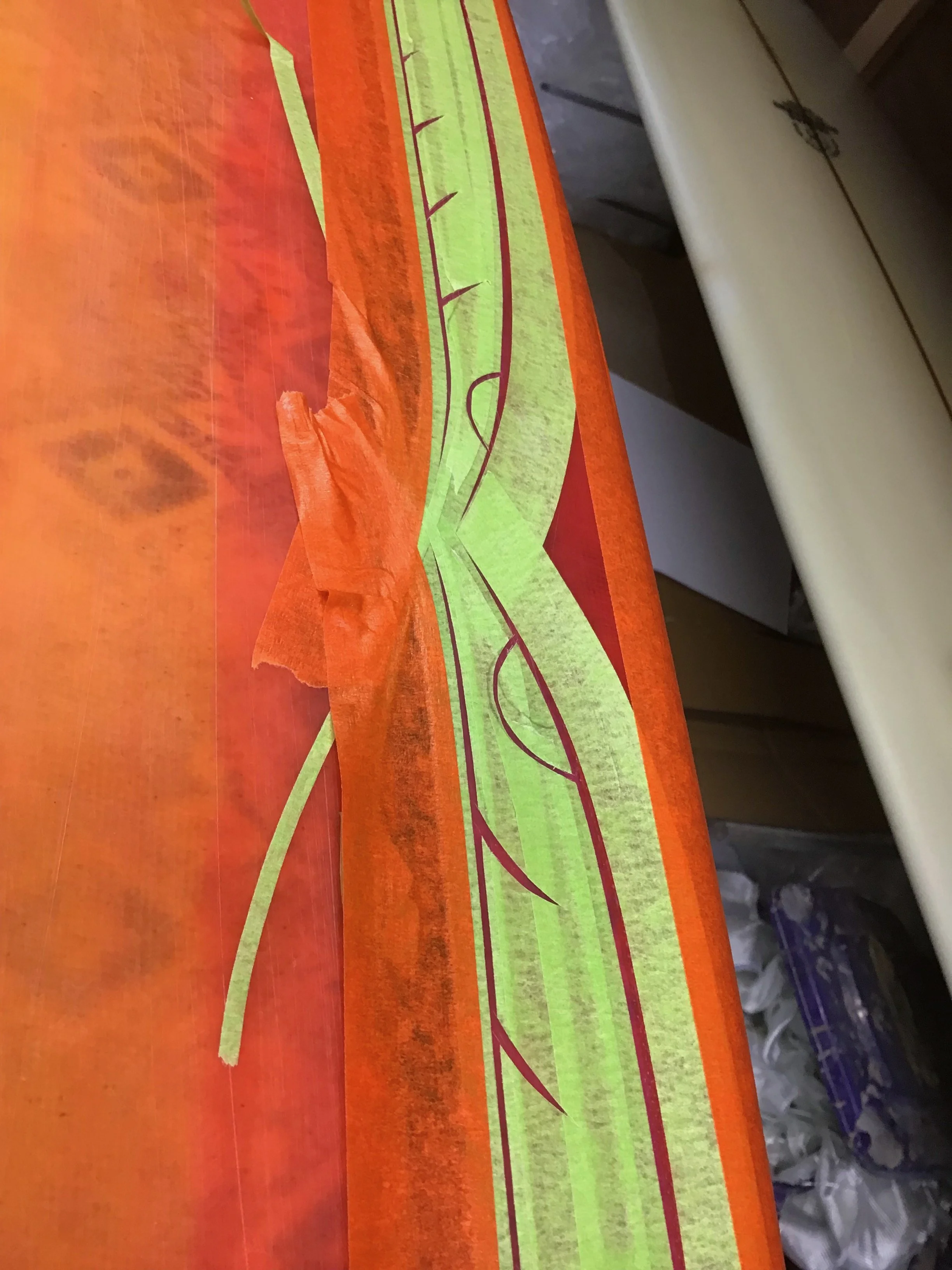
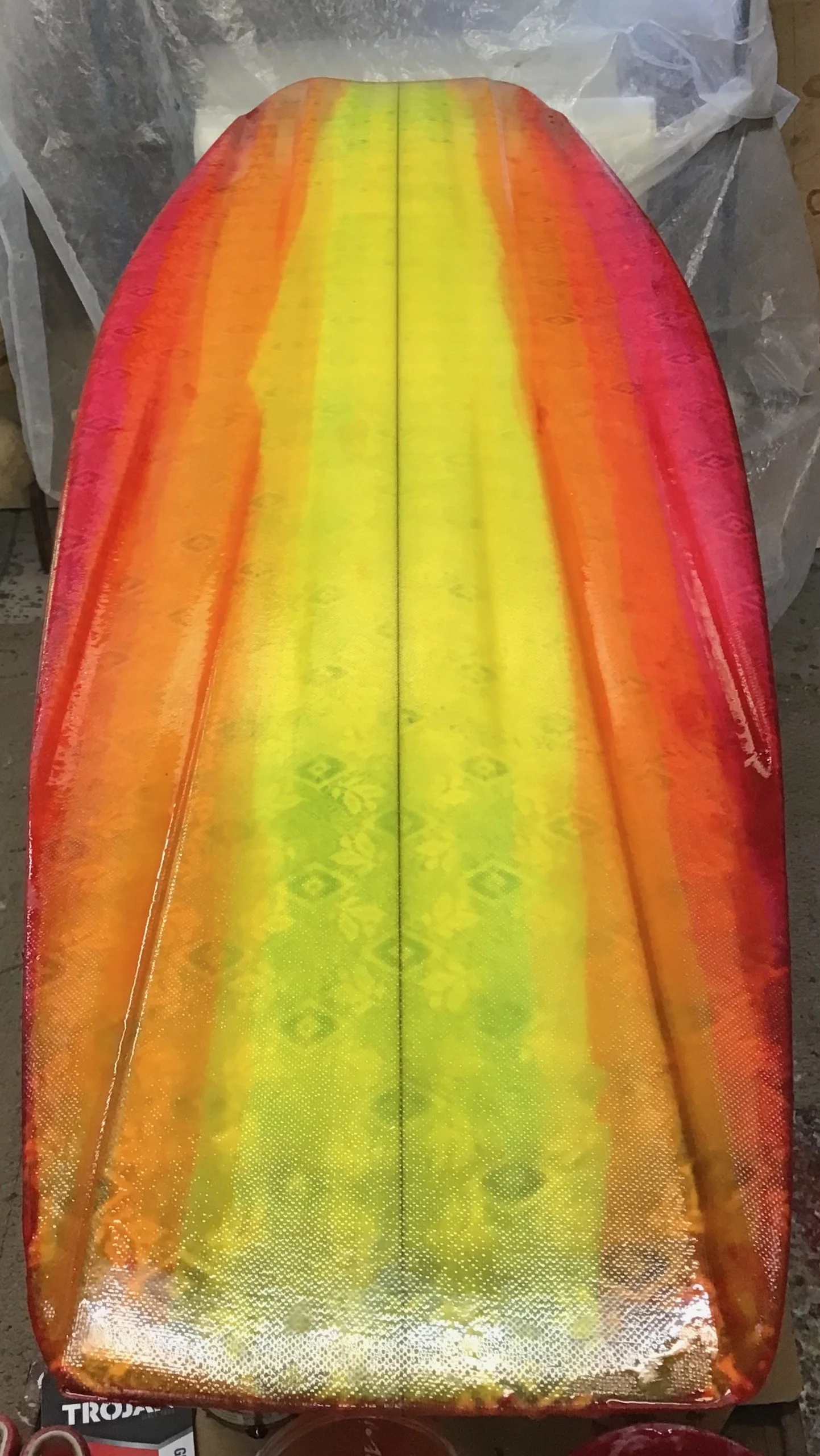
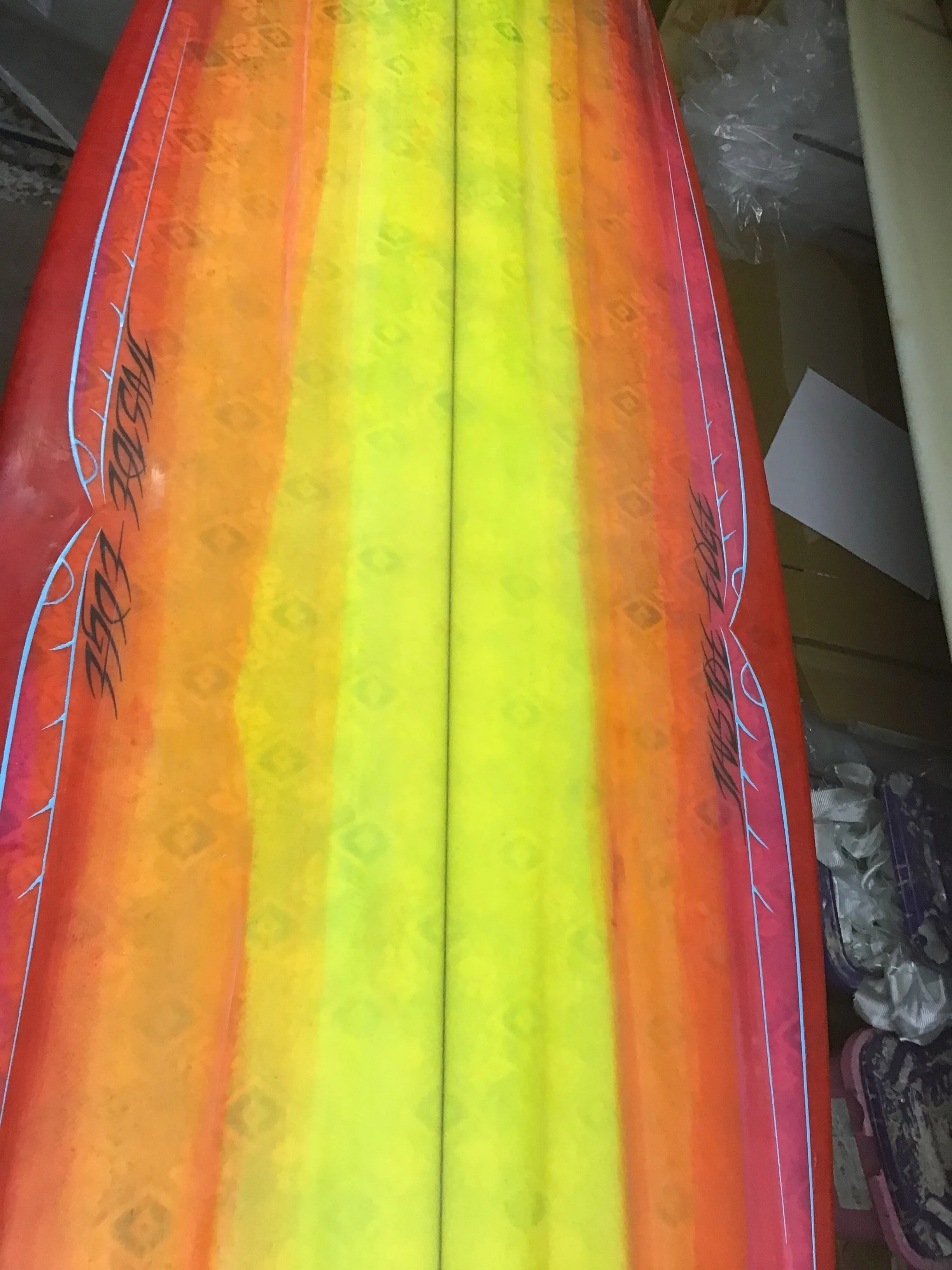
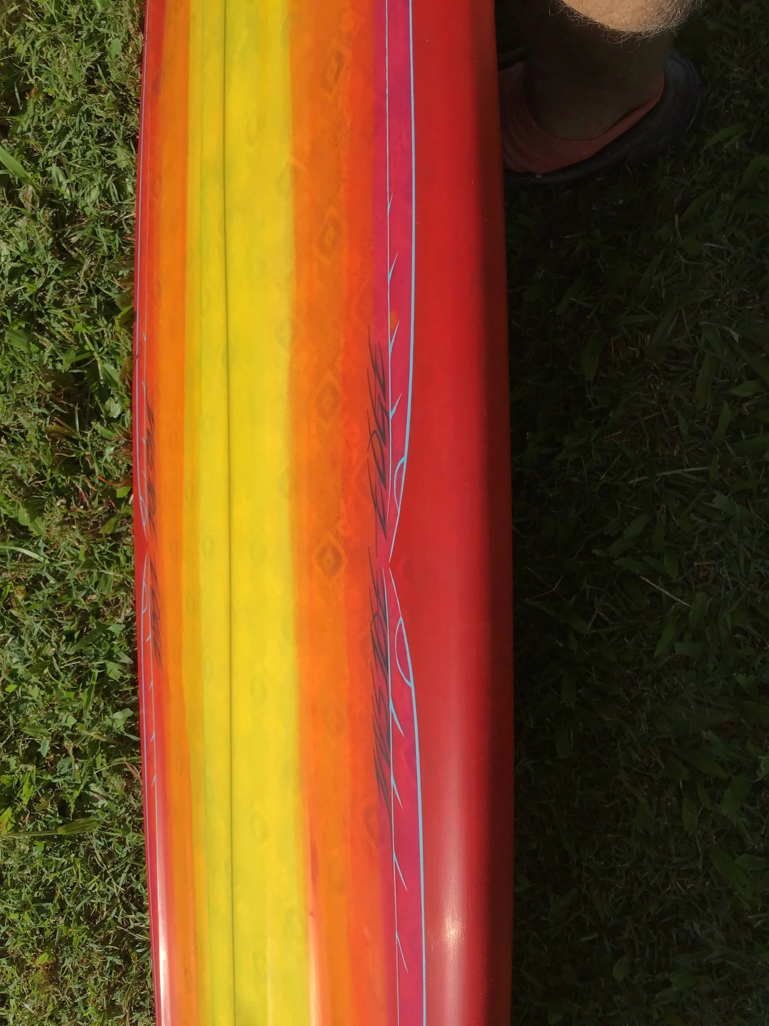
Next came the 5'10" extra-wide tail Jim Pollard-inspired thruster. I envisioned a spray design that continued the channel extension lines in the shape of the board outline, symmetrically meeting at the stringer. I’d drawn this design on unshaped blanks before but had never committed to it after shaping—until now. Choosing the colour scheme was difficult. Recently, orange has been giving me good vibes, so I decided to use four different shades. Mixing and ordering the colours was a challenge in itself. I applied two colours initially, separated by a central panel. This allowed me to tape off two sections at a time, reducing how often I had to re-tape. I used the same technique again for the innermost red/orange and outermost yellow/orange. Once the bottom colours were done, I laminated the bottom with clear resin (free-lapped), then filler-coated the lap on the deck and sanded it flat for glassing. The deck had a yellow tint with a cut-lap using 2 x 4oz glass. I foiled and set two side fins from a yellow-to-orange fade panel. After filler-coating both sides, I foiled the centre fin from a burnt-orange scrap panel I had previously made, and installed a 6” centre fin box. The board was fully sanded and wet-rubbed with 400 grit. I then added resin pinlines along the cut-lap edge using orange-mixed flow coat. After setting, I taped the pinlines and sprayed a light orange fade over the yellow/orange panel, tapering out about 2 inches near the side fins. The board was then finish-coated, sanded, and wet-rubbed to 1000 grit.
The third board was a 6’0” Pollard thruster design with channels. I kept the bottom clear and free-lapped, with white fins.The deck was airbrushed with a tapering prism design from nose to tail, using three colours. The inspiration came from an '80s spray I once saw for sale. I liked the sleek look and the illusion of speed—similar to a decal on a car. I was again torn over the colour palette. Burnt orange was my first choice, paired with bright green and purple to create contrast. The paint was applied directly to the foam, centre-outward. The board was laminated with a 6-ounce bottom and two 4-ounce layers on the deck. Before the finish coat, I applied black acrylic pin lines this being a filler spray. After a light sand to cut the finish coat the board was wet rubbed to 400 grit.
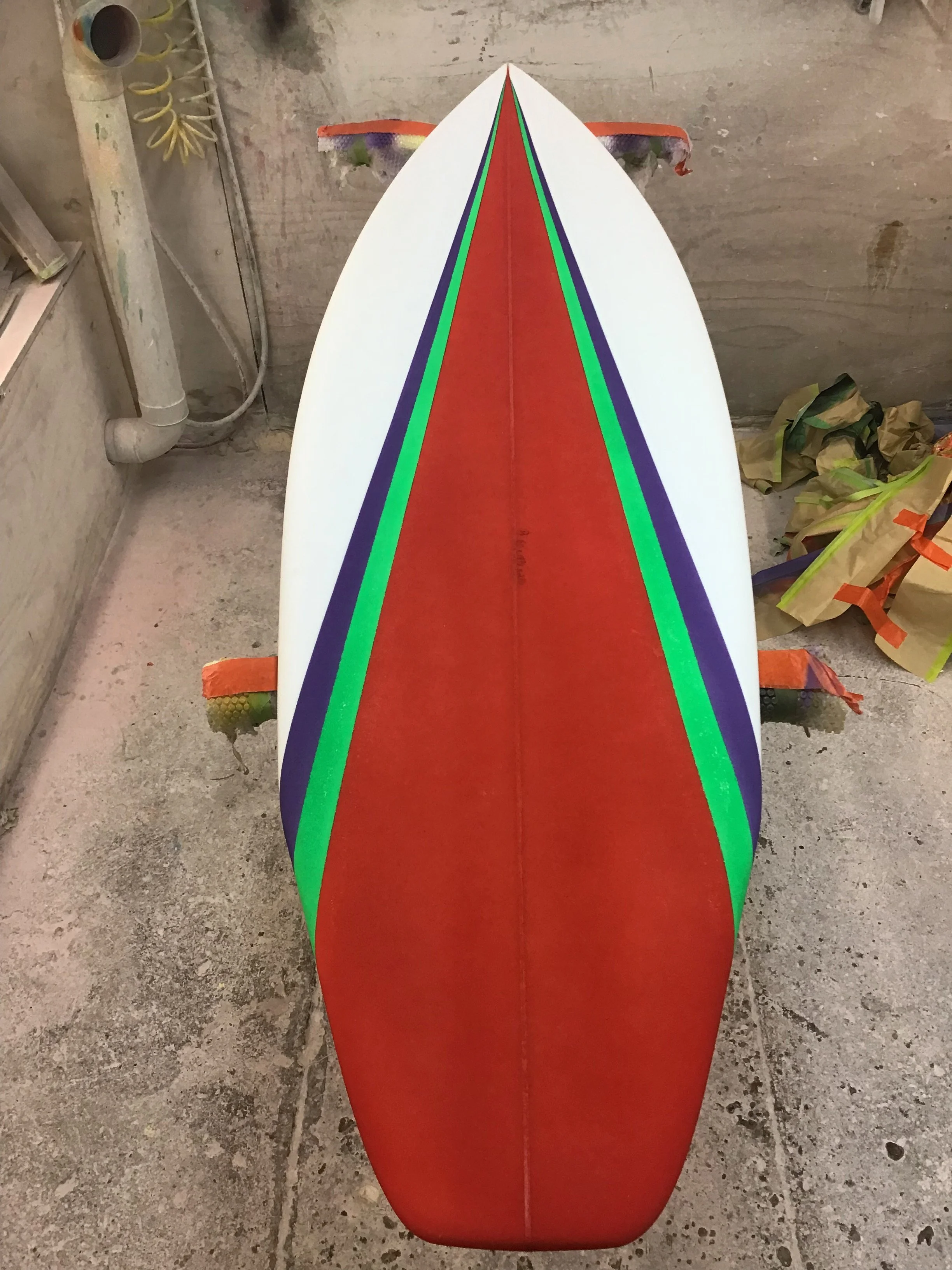
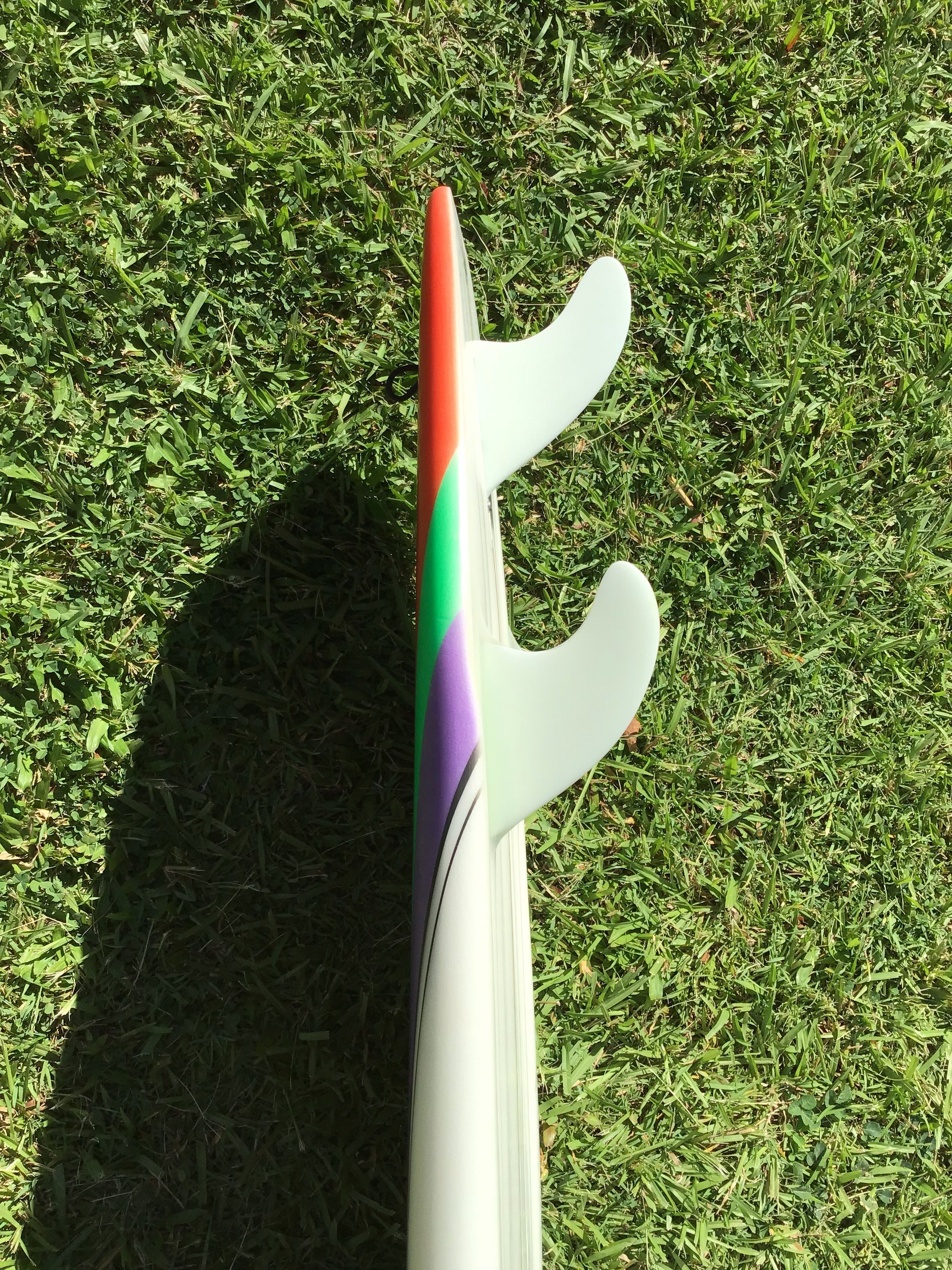
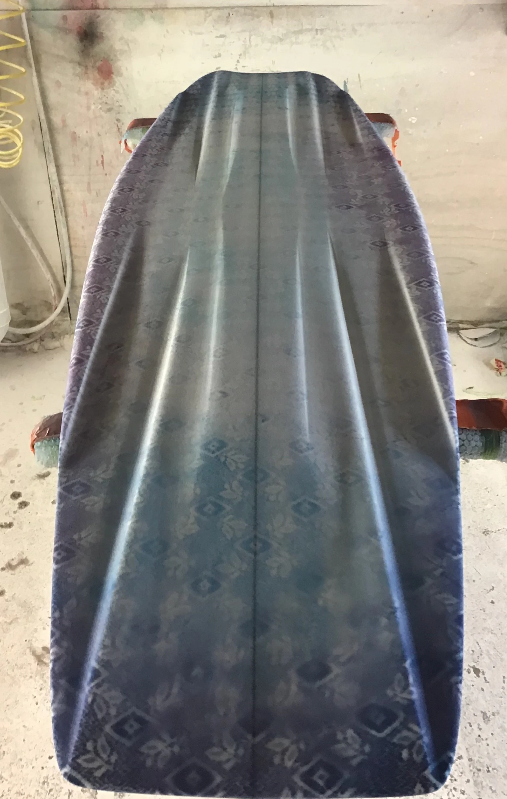
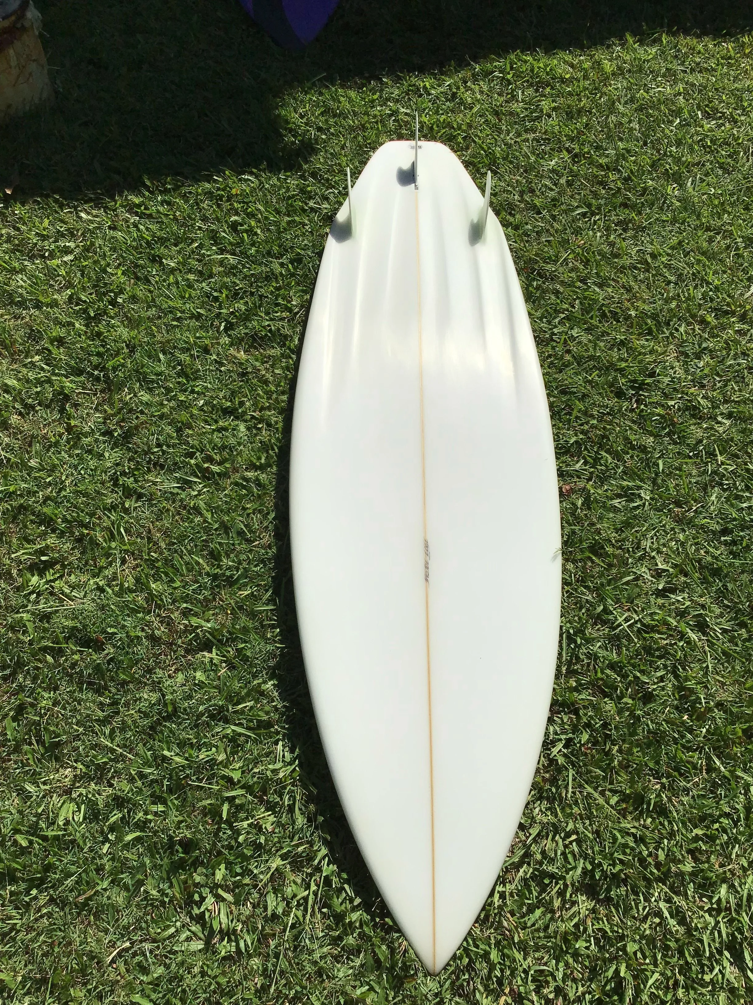
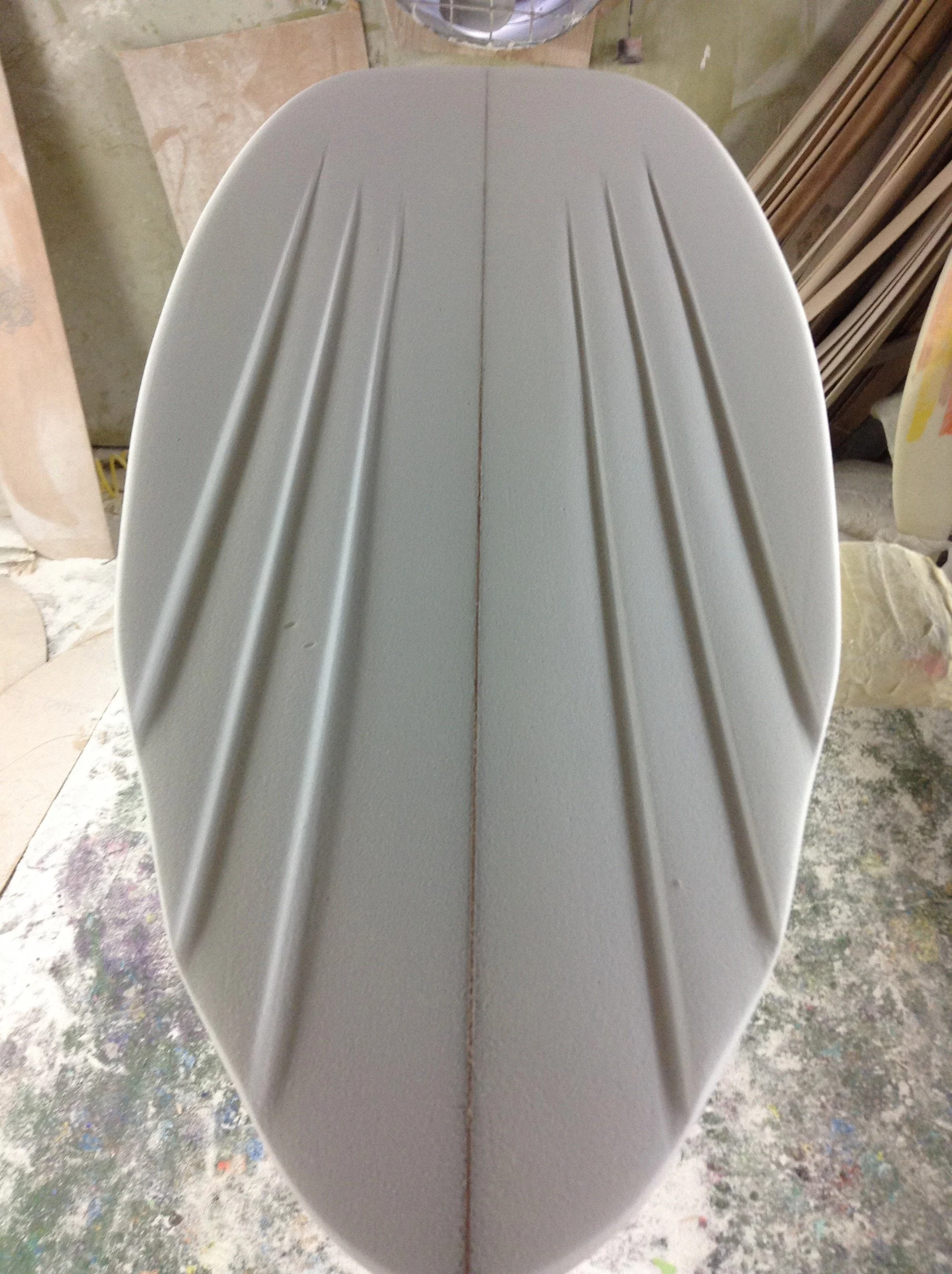
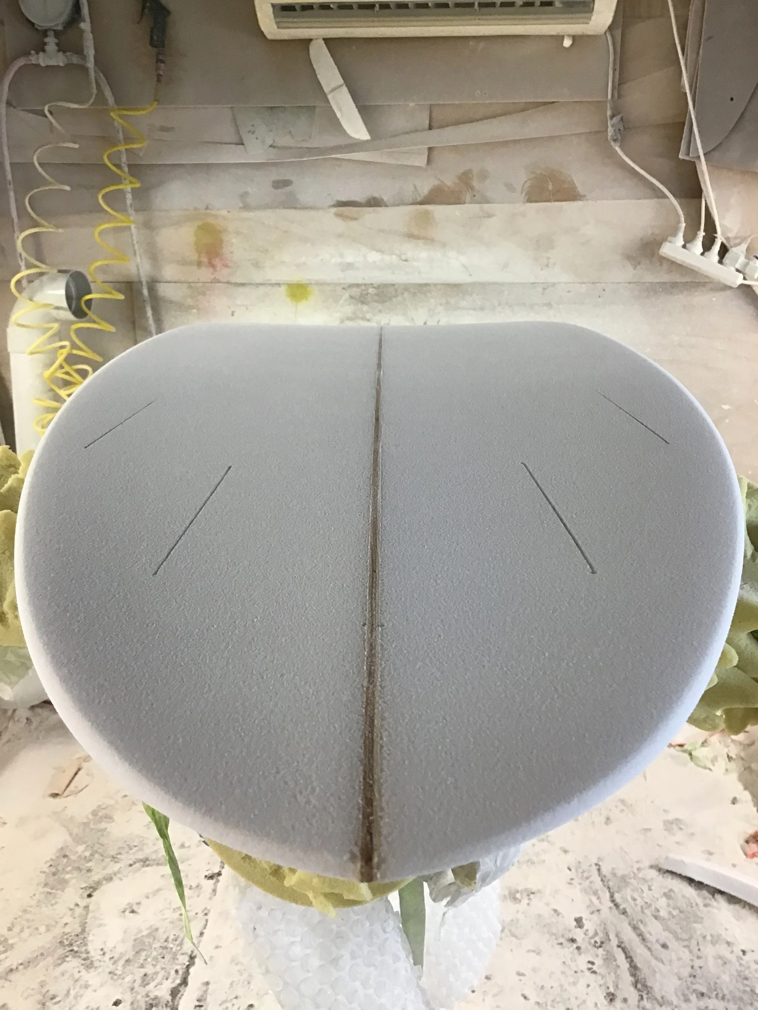
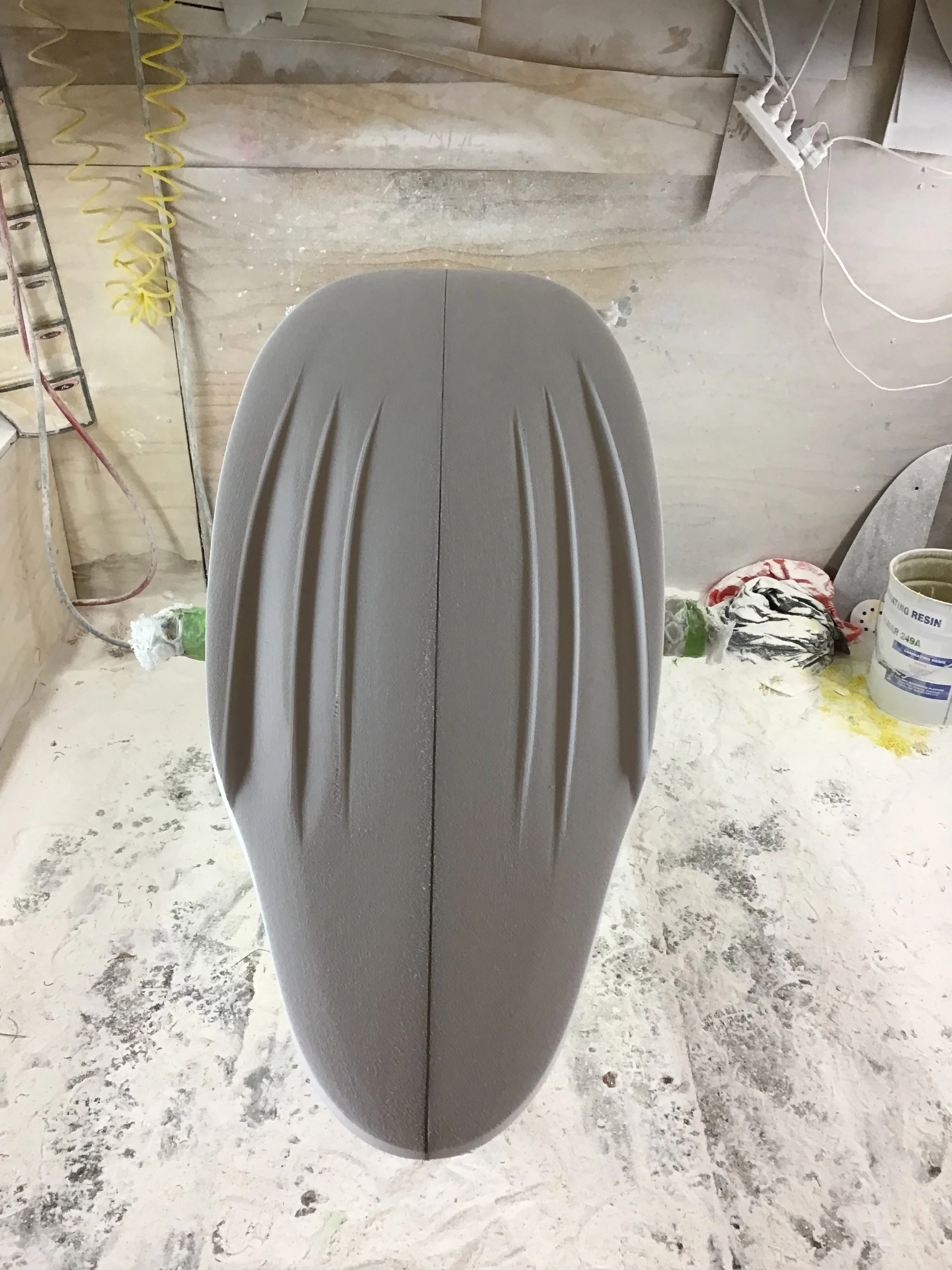
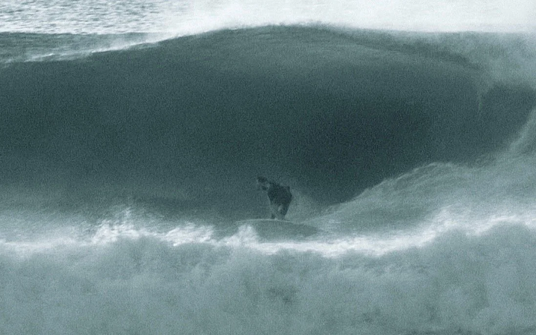
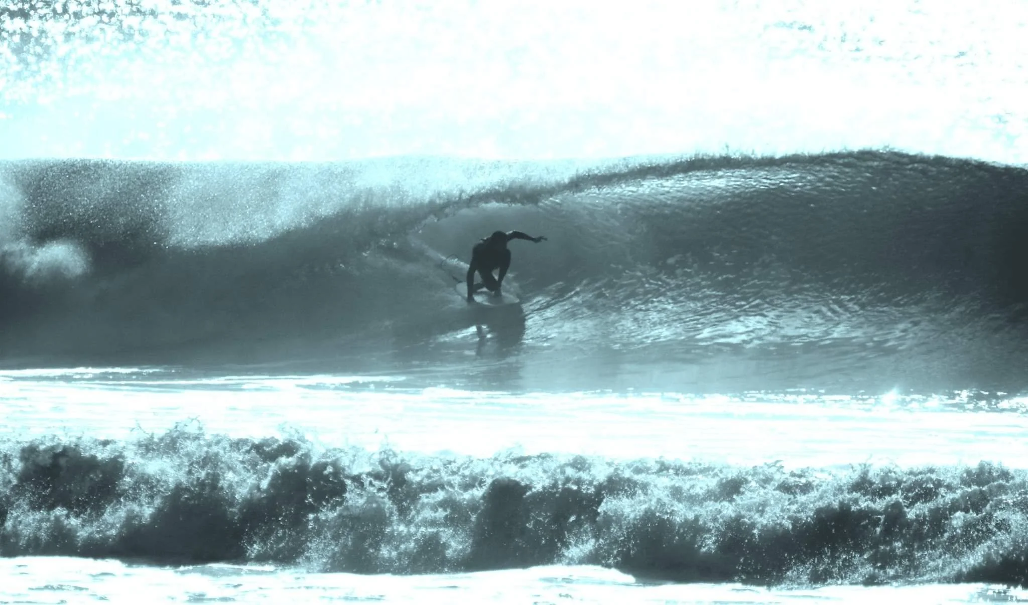
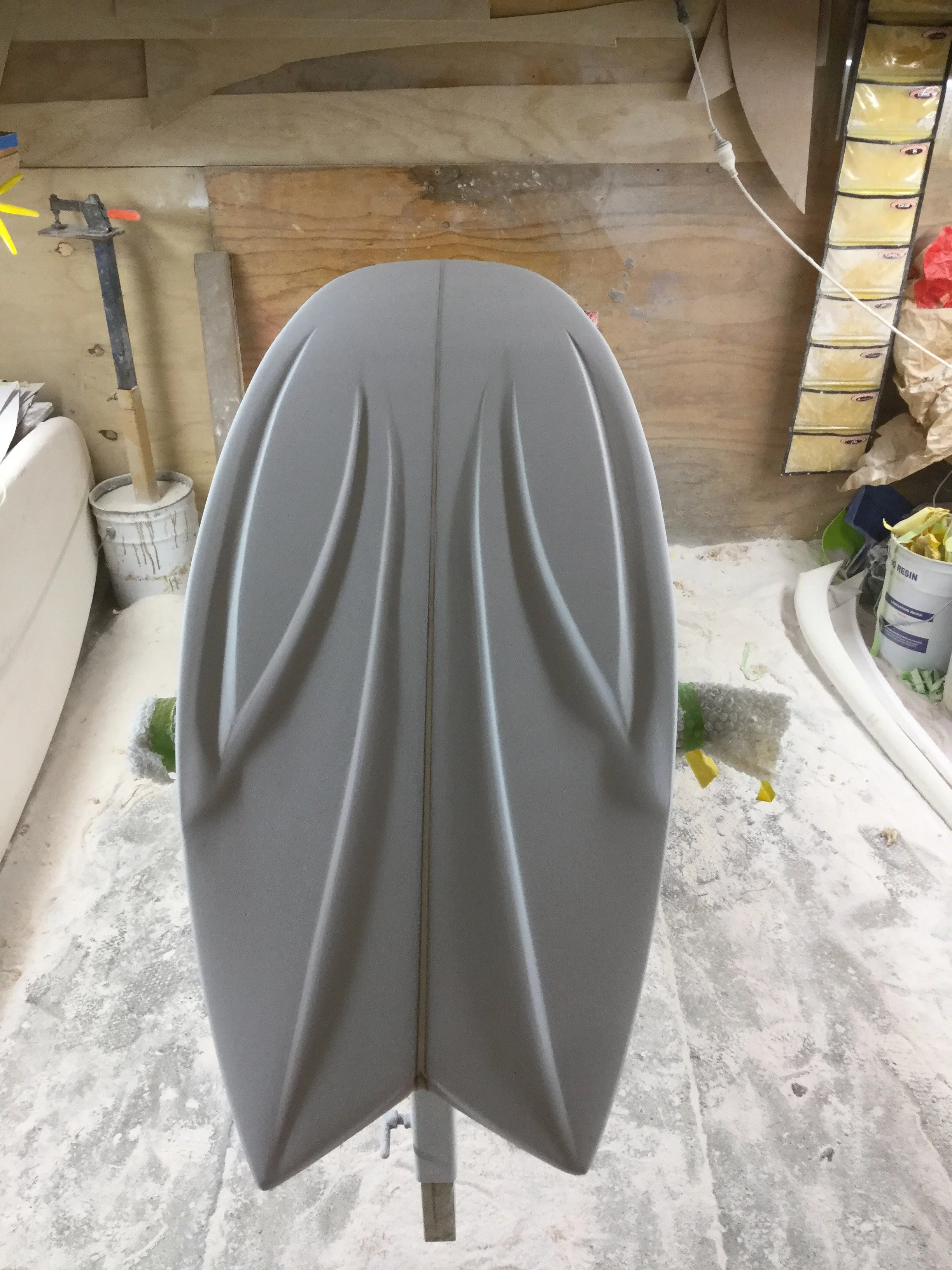
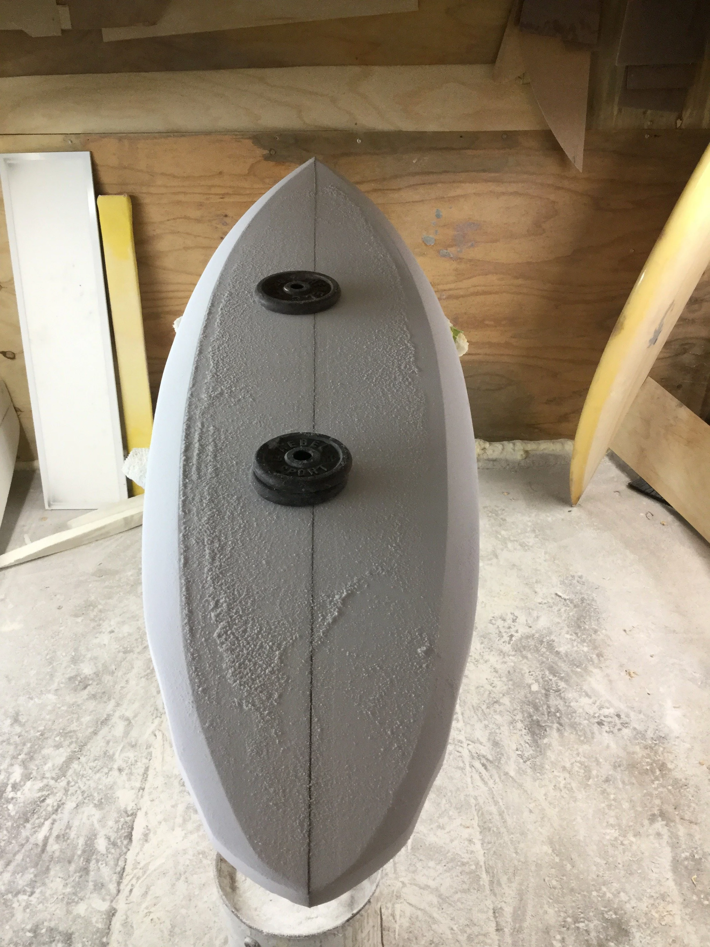
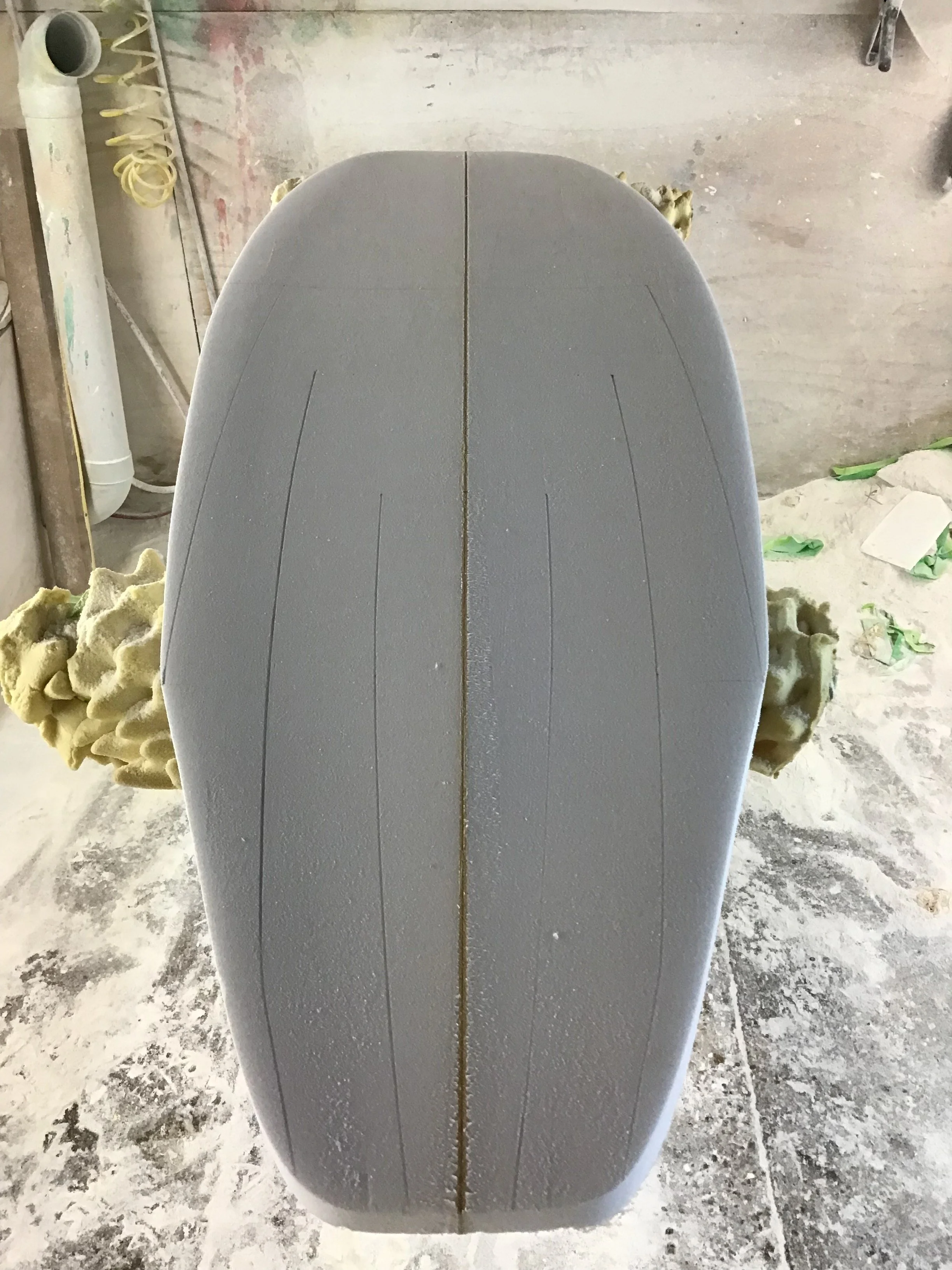
The fourth and final board was a fully experimental finless design, a concept I had been thinking about for years. The blank was a standard 64MB shortboard blank—stringerless, with only a black glue line down the centre. It had been a misorder and wasn’t useful for anything else. Instead of stripping glass off an old board (as I usually do for experiments), I took a chance with this one, even though the rocker was more pronounced than I’d normally use for finless designs. The idea was to shape a double ender using the tail template on both ends (nose and tail) which i what i did except for being completely symmetrically double ender i reduced the nose width on the end with the increased rocker. Otherwise the rail shape, foil thickness channel setup is all symmetrical. The board is intended to be ridden both ways either the tail being the wide end low tail rocker with the nose the narrower end increased rocker or flipped around and ridden as the tail end narrower with increased tail rocker and the front being ridden with the wide end reduced rocker forward. Using an old curtain I found in the rag bin as a stencil, I created a spray fade from light blue to violet, applied with an airbrush. The bottom was laminated with 6-ounce glass and tints (yellow, orange, red) radiating from the centre channel out to the rails, with deep red pigment on the laps. The deck didn’t go to plan. I’d aimed for a clear and red tint, but it failed, so I laminated and filler-coated with deep red pigment to fully block out the foam, glue line, and earlier colour. Once sanded, I masked off for a material inlay spray using the same curtain stencil—this time applying black acrylic paint. I added pin line highlights on the bottom in the shape of a curling peak, reminiscent of a breaking wave, using flow coat mixed with light blue pigment. Gloss coat applied, sanded, and wet-rubbed to 800 grit. (See photographs.)
Conception to Creation: A Reflection
There are always challenges when crafting surfboards, and these four were no exception—especially in the painting process. A lot of time went into making plans, templates, and colour swatches. Some ideas worked, others changed mid-process. Many decisions were made on gut feeling or impulse—even after days of consideration. Usually, there’d be a breakthrough or success—only to be followed by a mistake, blemish, or unexpected hurdle. Each of these challenges required decisions: to correct or adapt. Often, these detours shaped the next step in the process. Many lessons were learned. And while I always strive for perfection, these boards are far from it. But I see each visual imperfection as a stepping stone—something to learn from and improve upon, leading me to better skills, better techniques, and ultimately, better results.
– Braden Weir
Shaper / Colour and Resin Technician